
Page 278 - Excel Progamming Weekend Crash Course
P. 278
n540629 ch20.qxd 9/2/03 9:35 AM Page 253
Session 20 — Controls for User Forms 253
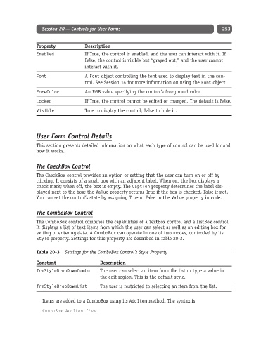
Property Description
Enabled If True, the control is enabled, and the user can interact with it. If
False, the control is visible but “grayed out,” and the user cannot
interact with it.
Font A Font object controlling the font used to display text in the con-
trol. See Session 14 for more information on using the Font object.
ForeColor An RGB value specifying the control’s foreground color
Locked If True, the control cannot be edited or changed. The default is False.
Visible True to display the control; False to hide it.
User Form Control Details
This section presents detailed information on what each type of control can be used for and
how it works.
The CheckBox Control
The CheckBox control provides an option or setting that the user can turn on or off by
clicking. It consists of a small box with an adjacent label. When on, the box displays a
check mark; when off, the box is empty. The Caption property determines the label dis-
played next to the box; the Value property returns True if the box is checked, False if not.
You can set the control’s state by assigning True or False to the Value property in code.
The ComboBox Control
The ComboBox control combines the capabilities of a TextBox control and a ListBox control.
It displays a list of text items from which the user can select as well as an editing box for
exiting or entering data. A ComboBox can operate in one of two modes, controlled by its
Style property. Settings for this property are described in Table 20-3.
Table 20-3 Settings for the ComboBox Control’s Style Property
Constant Description
frmStyleDropDownCombo The user can select an item from the list or type a value in
the edit region. This is the default style.
frmStyleDropDownList The user is restricted to selecting an item from the list.
Items are added to a ComboBox using its AddItem method. The syntax is:
ComboBox.AddItem Item
