
Page 440 - Microsoft Office Excel 2003 Programming Inside Out
P. 440
Part 5: Manipulating Excel Objects
Microsoft Office Excel 2003 Programming Inside Out
Chapter 19
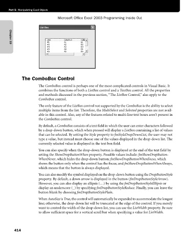
The ComboBox Control
The ComboBox control is perhaps one of the most complicated controls in Visual Basic. It
combines the functions of both a ListBox control and a TextBox control. All the properties
and methods discussed in the previous section, “The ListBox Control,” also apply to the
ComboBox control.
The only feature of the ListBox control not supported by the ComboBox is the ability to select
multiple items from the list. Therefore, the MultiSelect and Selected properties are not avail-
able in this control. Also, any of the features related to multi-line text boxes aren’t present in
the ComboBox control.
By default, a ComboBox consists of a text field in which the user can enter characters followed
by a drop-down button, which when pressed will display a ListBox containing a list of values
that can be selected. By setting the Style property to fmStyleDropDownList, the user may not
type a value, but instead must choose one of the values displayed in the drop-down list. The
currently selected value is displayed in the text box field.
You can also specify when the drop-down button is displayed at the end of the text field by
setting the ShowDropButtonWhen property. Possible values include: fmShowDropButton-
WhenNever, which hides the drop-down button; fmShowDropButtonWhenFocus, which
shows the button only when the control has the focus; and fmShowDropButtonWhenAlways,
which means that the button is always displayed.
You can also modify the symbol displayed on the drop-down button using the DropButtonStyle
property. By default, a down arrow is displayed in the button (fmDropButtonStyleArrow).
However, you can also display an ellipsis (…) by using the fmDropButtonStyleEllipsis or
display an underscore (_) by specifying fmDropButtonStyleReduce. Finally, you can leave the
button blank by choosing fmDropButtonStylePlain.
When AutoSize is True, the control will automatically be expanded to accommodate the longest
line; otherwise, the drop-down list will be truncated at the edge of the control. If you merely
want to control the width of the drop-down list, you can use the ListWidth property. Be sure
to allow sufficient space for a vertical scroll bar when specifying a value for ListWidth.
414
