
Page 178 -
P. 178
Chapter 4 • Business Reporting, Visual Analytics, and Business Performance Management 177
To better understand the current and future trends in the field of data visualization,
it helps to begin with some historical context.
A Brief history of Data Visualization
Despite the fact that predecessors to data visualization date back to the second century
AD, most developments have occurred in the last two and a half centuries, predominantly
during the last 30 years (Few, 2007). Although visualization has not been widely
recognized as a discipline until fairly recently, today’s most popular visual forms date
back a few centuries. Geographical exploration, mathematics, and popularized history
spurred the creation of early maps, graphs, and timelines as far back as the 1600s, but
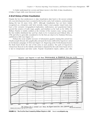
William Playfair is widely credited as the inventor of the modern chart, having created
the first widely distributed line and bar charts in his Commercial and Political Atlas of
1786 and what is generally considered to be the first pie chart in his Statistical Breviary,
published in 1801 (see Figure 4.2).
Perhaps the most notable innovator of information graphics during this period was
Charles Joseph Minard, who graphically portrayed the losses suffered by Napoleon’s army
in the Russian campaign of 1812 (see Figure 4.3). Beginning at the Polish–Russian border,
the thick band shows the size of the army at each position. The path of Napoleon’s
retreat from Moscow in the bitterly cold winter is depicted by the dark lower band, which
is tied to temperature and time scales. Popular visualization expert, author, and critic
figuRe 4.2 The First Pie Chart Created by William Playfair in 1801. Source: en.wikipedia.org.
M04_SHAR9209_10_PIE_C04.indd 177 1/25/14 7:34 AM