
Page 179 -
P. 179
178 Part II • Descriptive Analytics
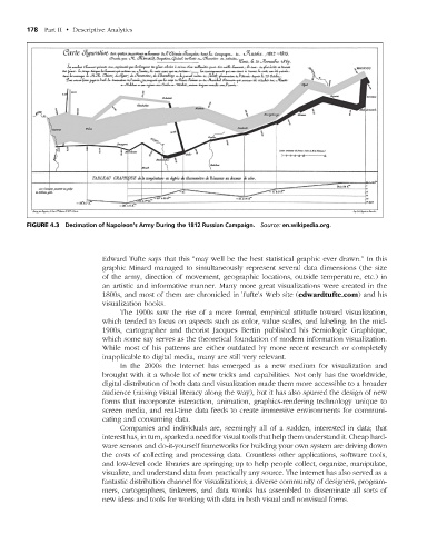
figuRe 4.3 Decimation of Napoleon’s Army During the 1812 Russian Campaign. Source: en.wikipedia.org.
Edward Tufte says that this “may well be the best statistical graphic ever drawn.” In this
graphic Minard managed to simultaneously represent several data dimensions (the size
of the army, direction of movement, geographic locations, outside temperature, etc.) in
an artistic and informative manner. Many more great visualizations were created in the
1800s, and most of them are chronicled in Tufte’s Web site (edwardtufte.com) and his
visualization books.
The 1900s saw the rise of a more formal, empirical attitude toward visualization,
which tended to focus on aspects such as color, value scales, and labeling. In the mid-
1900s, cartographer and theorist Jacques Bertin published his Semiologie Graphique,
which some say serves as the theoretical foundation of modern information visualization.
While most of his patterns are either outdated by more recent research or completely
inapplicable to digital media, many are still very relevant.
In the 2000s the Internet has emerged as a new medium for visualization and
brought with it a whole lot of new tricks and capabilities. Not only has the worldwide,
digital distribution of both data and visualization made them more accessible to a broader
audience (raising visual literacy along the way), but it has also spurred the design of new
forms that incorporate interaction, animation, graphics-rendering technology unique to
screen media, and real-time data feeds to create immersive environments for communi-
cating and consuming data.
Companies and individuals are, seemingly all of a sudden, interested in data; that
interest has, in turn, sparked a need for visual tools that help them understand it. Cheap hard-
ware sensors and do-it-yourself frameworks for building your own system are driving down
the costs of collecting and processing data. Countless other applications, software tools,
and low-level code libraries are springing up to help people collect, organize, manipulate,
visualize, and understand data from practically any source. The Internet has also served as a
fantastic distribution channel for visualizations; a diverse community of designers, program-
mers, cartographers, tinkerers, and data wonks has assembled to disseminate all sorts of
new ideas and tools for working with data in both visual and nonvisual forms.
M04_SHAR9209_10_PIE_C04.indd 178 1/25/14 7:34 AM