
Page 184 -
P. 184
Chapter 4 • Business Reporting, Visual Analytics, and Business Performance Management 183
smaller rectangles representing sub-branches. A leaf node’s rectangle has an area pro-
portional to a specified dimension on the data. Often the leaf nodes are colored to
show a separate dimension of the data. When the color and size dimensions are
correlated in some way with the tree structure, one can often easily see patterns
that would be difficult to spot in other ways, such as if a certain color is particularly
relevant. A second advantage of tree maps is that, by construction, they make efficient
use of space. As a result, they can legibly display thousands of items on the screen
simultaneously.
Even though these charts and graphs cover a major part of what is commonly used
in information visualization, they by no means cover it all. Nowadays, one can find many
other specialized graphs and charts that serve a specific purpose. Furthermore, current
trends are to combine/hybridize and animate these charts for better looking and more
intuitive visualization of today’s complex and volatile data sources. For instance, the
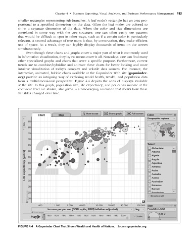
interactive, animated, bubble charts available at the Gapminder Web site (gapminder.
org) provide an intriguing way of exploring world health, wealth, and population data
from a multidimensional perspective. Figure 4.4 depicts the sorts of displays available
at the site. In this graph, population size, life expectancy, and per capita income at the
continent level are shown; also given is a time-varying animation that shows how these
variables changed over time.
figuRe 4.4 A Gapminder Chart That Shows Wealth and Health of Nations. Source: gapminder.org.
M04_SHAR9209_10_PIE_C04.indd 183 1/25/14 7:34 AM