
Page 104 - Statistics II for Dummies
P. 104
88 Part II: Using Different Types of Regression to Make Predictions
Pinpointing Possible Relationships
The third step in doing a multiple regression analysis (see the list in the
“Stepping through the analysis” section) is to find out which (if any) of your
possible x variables are actually related to y. If an x variable has no relationship
with y, including it in the model is pointless. Data analysts use a combination
of scatterplots and correlations to examine relationships between pairs of
variables (as you can see in Chapter 4). Although you can view these two
techniques under the heading of looking for relationships, I walk you through
each one separately in the following sections to discuss their nuances.
Making scatterplots
You make scatterplots in multiple linear regression to get a handle on
whether your possible x variables are even related to the y variable you’re
studying. To investigate these possible relationships, you make one scatterplot
of each x variable with the response variable y. If you have k different x variables
being considered for the final model, you make k different scatterplots.
To make a scatterplot in Minitab, enter your data in columns, where each
column represents a variable and each row represents all the data from one
individual. Go to Graph>Scatterplots>Simple. Select your y variable on the
left-hand side, and click Select. That variable appears in the y-variable box on
the right-hand side. Then select your x variable on the left-hand side, and
click Select. That variable appears in the x-variable box on the right-hand
side. Click OK.
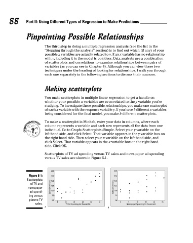
Scatterplots of TV ad spending versus TV sales and newspaper ad spending
versus TV sales are shown in Figure 5-1.
20.0 20.0
Figure 5-1: 17.5 17.5
Scatterplots 15.0 15.0
of TV and
newspaper Sales (in millions) 12.5 Sales (in millions) 12.5
ad spend- 10.0 10.0
ing versus 7.5 7.5
plasma TV 5.0 5.0
0 10 20 30 40 50 0 5 10 15 20 25
sales. TV Ad Spending (in thousands) Newspaper Spending (in thousands)
a b
10_466469-ch05.indd 88 7/24/09 9:32:33 AM