Page 45 - Statistics II for Dummies
P. 45

Chapter 2: Finding the Right Analysis for the Job  29


                                Suppose you’re an avid golfer and you want to figure out how much time you
                                should spend on your putting game. The question is this: Is the number of
                                putts related to your total score? If the answer is yes, then spending time on
                                your putting game makes sense. If not, then you can slack off on it a bit. Both
                                of these variables are quantitative variables, and you’re looking for a connec-
                                tion between them. You collect data on 100 rounds of golf played by golfers
                                at your favorite course over a weekend. Following are the first few lines of
                                your data set.

                                Round                  Number of Putts       Total Score
                                1                      23                    76
                                2                      27                    80
                                3                      28                    80
                                4                      29                    80
                                5                      30                    80
                                6                      29                    82
                                7                      30                    83
                                8                      31                    83
                                9                      33                    83
                                10                     26                    84

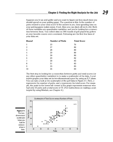
                                The first step in looking for a connection between putts and total scores (or
                                any other quantitative variables) is to make a scatterplot of the data. A scat-
                                terplot graphs your data set in two-dimensional space by using an X,Y plane.
                                You can take a look at the scatterplot of the golf data in Figure 2-1. Here, x
                                represents the number of putts, and y represents the total score. For exam-
                                ple, the point in the lower-left corner of the graph represents someone who
                                had only 23 putts and a total score of 75. (For instructions on making a scat-
                                terplot by using Minitab, see Chapter 4.)


                                        Scatterplot of Total Score versus Number of Putts
                                   120

                                   110
                        Figure 2-1:
                         The two-  Total Score  100
                      dimensional
                       scatterplot   90
                        helps you
                          look for
                         relation-  80
                          ships in
                           data.      20     25     30     35     40     45     50
                                                         Putts


          06_466469-ch02.indd   29                                                                    7/24/09   9:31:38 AM
   40   41   42   43   44   45   46   47   48   49   50