
Page 29 - Boiler_Operators_Handbook,_Second_Edition
P. 29
14 Boiler Operator’s Handbook
that they had a misconception about their operations increase in makeup) which frequently allows connecting
just like the one mentioned above. the change to another event that occurred at the same
New control systems and data acquisition systems time. Undesirable trends can include a constant decrease
typically have graphic capability. They are typically re- in evaporation rate, an increasing stack temperature,
ferred to as trends. When you have the opportunity to and a gradual decrease in condensate temperature, all
use the systems to look at your data take advantage of of which are indicative of something going wrong and a
it. Trending data which produces a graph on the moni- need to discover what’s causing it.
tor or display in your plant on a regular basis simply There are, however, load related reasons for un-
provides one more visual aid that you can use to catch desirable trends and situations where changes in load
problems early or detect changes that you would not cloud the issue, producing oscillations in a trend graphic
have noticed otherwise. that prevent detecting trends. Many times those devia-
Lacking on the fancy instrumentation doesn’t re- tions can be resolved by filtering the data so you’re only
strict you in creating graphics that serve as a visual aid. looking at a trend graphic for a specific load on a boiler,
You can do what I have done for years. Leaf through the plant, or other specific equipment or system. At other
logbook and enter the data into one of the spreadsheet times you may want to actually plot the data relative to
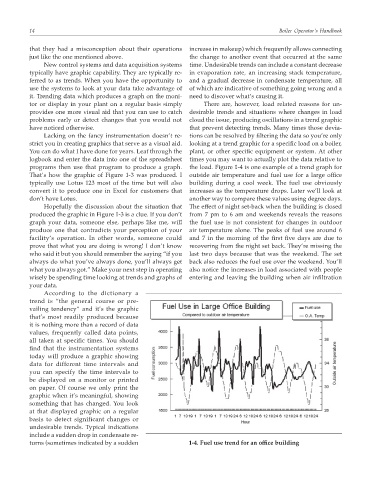
programs then use that program to produce a graph. the load. Figure 1-4 is one example of a trend graph for
That’s how the graphic of Figure 1-3 was produced. I outside air temperature and fuel use for a large office
typically use Lotus 123 most of the time but will also building during a cool week. The fuel use obviously
convert it to produce one in Excel for customers that increases as the temperature drops. Later we’ll look at
don’t have Lotus. another way to compare these values using degree days.
Hopefully the discussion about the situation that The effect of night set-back when the building is closed
produced the graphic in Figure 1-3 is a clue. If you don’t from 7 pm to 6 am and weekends reveals the reasons
graph your data, someone else, perhaps like me, will the fuel use is not consistent for changes in outdoor
produce one that contradicts your perception of your air temperature alone. The peaks of fuel use around 6
facility’s operation. In other words, someone could and 7 in the morning of the first five days are due to
prove that what you are doing is wrong! I don’t know recovering from the night set back. They’re missing the
who said it but you should remember the saying “if you last two days because that was the weekend. The set
always do what you’ve always done, you’ll always get back also reduces the fuel use over the weekend. You’ll
what you always got.” Make your next step in operating also notice the increases in load associated with people
wisely be spending time looking at trends and graphs of entering and leaving the building when air infiltration
your data.
According to the dictionary a
trend is “the general course or pre-
vailing tendency” and it’s the graphic
that’s most readily produced because
it is nothing more than a record of data
values, frequently called data points,
all taken at specific times. You should
find that the instrumentation systems
today will produce a graphic showing
data for different time intervals and
you can specify the time intervals to
be displayed on a monitor or printed
on paper. Of course we only print the
graphic when it’s meaningful, showing
something that has changed. You look
at that displayed graphic on a regular
basis to detect significant changes or
undesirable trends. Typical indications
include a sudden drop in condensate re-
turns (sometimes indicated by a sudden 1-4. Fuel use trend for an office building