
Page 80 - Fundamentals of Air Pollution
P. 80
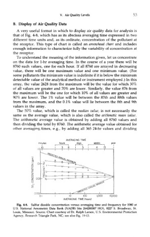
V. Air Quality Levels                   53

        B. Display of Air Quality Data
          A very useful format in which to display air quality data for analysis is
        that of Fig. 4-8, which has as its abscissa averaging time expressed in two
        different time units and, as its ordinate, concentration of the pollutant at
        the receptor. This type of chart is called an arrowhead chart and includes
        enough information to characterize fully the variability of concentration at
        the receptor.
          To understand the meaning of the information given, let us concentrate
        on the data for 1-hr averaging time. In the course of a year there will be
        8760 such values, one for each hour. If all 8760 are arrayed in decreasing
        value, there will be one maximum value and one minimum value. (For
        some pollutants the minimum value is indefinite if it is below the minimum
        detectable value of the analytical method or instrument employed.) In this
        array, the value 2628 from the maximum will be the value for which 30%
        of all values are greater and 70% are lower. Similarly, the value 876 from
        the maximum will be the one for which 10% of all values are greater and
        90% are lower. The 1% value will be between the 87th and 88th values
        from the maximum, and the 0.1% value will lie between the 8th and 9th
        values in the array.
          The 50% value, which is called the median value, is not necessarily the
        same as the average value, which is also called the arithmetic mean value.
        The arithmetic average value is obtained by adding all 8760 values and
        then dividing the total by 8760. The arithmetic average value obtained for
        other averaging times, e.g., by adding all 365 24-hr values and dividing


          Fig. 4-8. Sulfur dioxide concentration versus averaging time and frequency for 1980 at
        U.S. National Aerometric Data Bank (NADB) Site 264280007 HOI, 8227 S. Broadway, St.
        Louis, Missouri. Source: Chart courtesy of Dr. Ralph Larsen, U.S. Environmental Protection
        Agency, Research Triangle Park, NC; see also Fig. 19-13.