
Page 151 - Intermediate Statistics for Dummies
P. 151
12_045206 ch07.qxd 2/1/07 9:54 AM Page 130
130
Part II: Making Predictions by Using Regression
Starting Out with Scatterplots
As with any type of data analysis, before you plunge in and select a model
that you think fits the data, or that is supposed to fit the data, you have to
step back and take a look at the data and see whether any patterns emerge.
To do this, look at a scatterplot of the data, and see whether or not you can
draw a smooth curve through the data and find that most of the points follow
along that curve.
Suppose you’re interested in modeling how quickly a rumor spreads. One
person knows a secret, tells another person, and now two know the secret;
each of them tells a person, and now four know the secret; some of those
people may pass it on, and so it goes on down the line. Pretty soon, a large
number of people know the secret (which is a secret no longer). To collect your
data, you count the number of people who know a secret by tracking who tells
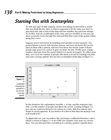
who over a six-day period. You can see a scatterplot of the data in Figure 7-1.
Correlation r = 0.906
Number of people who know the secret 35
30
20
Figure 7-1: 25
A 15
scatterplot
showing the 10
spread of a 5
secret over
a six-day 0
1 2 3 4 5 6
period.
Day
In this situation, the explanatory variable, x, is day, and the response vari-
able, y, is the number of people who know the secret. Looking at Figure 7-1,
you can see a pattern between the values of x and y. But this pattern isn’t
linear. It curves upwards. If you tried to fit a line to this data set anyway, how
well would it fit?
To figure this out, you can look at the correlation coefficient between x and y,
which is found on Figure 7-1 to be 0.906 (see Chapter 4 for more on correla-
tion). You can interpret this correlation as a strong, positive (uphill) linear