Page 60 - Intermediate Statistics for Dummies
P. 60

06_045206 ch02.qxd  2/1/07  9:42 AM  Page 39
                                                                       Chapter 2: Sorting through Statistical Techniques
                                                      Number of Putts
                                                                         Total Score
                                                                         83
                                                      30
                                                                         83
                                                      31
                                                                         83
                                                      33
                                                                         84
                                                      26
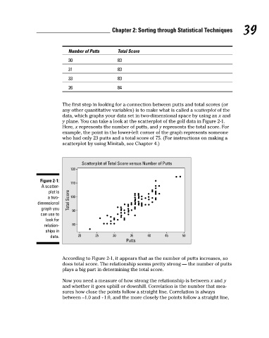
                                                    The first step in looking for a connection between putts and total scores (or
                                                    any other quantitative variables) is to make what is called a scatterplot of the
                                                    data, which graphs your data set in two-dimensional space by using an x and
                                                    y plane. You can take a look at the scatterplot of the golf data in Figure 2-1.
                                                    Here, x represents the number of putts, and y represents the total score. For
                                                    example, the point in the lower-left corner of the graph represents someone
                                                    who had only 23 putts and a total score of 75. (For instructions on making a
                                                    scatterplot by using Minitab, see Chapter 4.)                          39
                                                           Scatterplot of Total Score versus Number of Putts
                                                       120
                                           Figure 2-1:
                                                       110
                                           A scatter-
                                              plot is
                                              a two-  Total Score  100
                                          dimensional
                                           graph you   90
                                           can use to
                                             look for
                                            relation-  80
                                             ships in
                                               data.      20     25     30    35     40     45     50
                                                                             Putts
                                                    According to Figure 2-1, it appears that as the number of putts increases, so
                                                    does total score. The relationship seems pretty strong — the number of putts
                                                    plays a big part in determining the total score.
                                                    Now you need a measure of how strong the relationship is between x and y
                                                    and whether it goes uphill or downhill. Correlation is the number that mea-
                                                    sures how close the points follow a straight line. Correlation is always
                                                    between –1.0 and +1.0, and the more closely the points follow a straight line,
   55   56   57   58   59   60   61   62   63   64   65