
Page 49 - Laboratory Manual in Physical Geology
P. 49
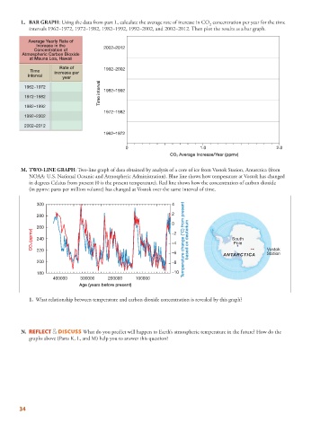
L.      BAR GRAPH : Using the data from part L, calculate the average rate of increase in CO   concentration per year for the time
                                                                               2
            intervals 1962–1972, 1972–1982, 1982–1992, 1992–2002, and 2002–2012. Then plot the results as a bar graph.
            Average Yearly Rate of
               Increase in the
              Concentration of          2002–2012
         Atmospheric Carbon Dioxide
            at Mauna Loa, Hawaii
                       Rate of
            Time     increase per       1992–2002
           interval
                        year
                                      Time interval
          1962–1972                     1982–1992
          1972–1982
          1982–1992
                                        1972–1982
          1992–2002
          2002–2012
                                        1962–1972

                                                0                          1.0                          2.0
                                                                CO 2 Average Increase/Year (ppmv)


           M.     TWO-LINE GRAPH : Two-line graph of data obtained by analysis of a core of ice from Vostok Station, Antarctica (from
            NOAA: U.S. National Oceanic and Atmospheric Administration). Blue line shows how temperature at Vostok has changed
            in degrees Celsius from present (0 is the present temperature). Red line shows how the concentration of carbon dioxide
            (in ppmv: parts per million volume) has changed at Vostok over the same interval of time.


               300                                               4

               280                                               2
                                                                 0
               260
             CO 2 (ppmv)  240                                    –2  Temperature change (°C) from present based on deuterium  South

                                                                 –4
                                                                                        Pole
               220
                                                                 –6                 ANTARCTICA      Vostok
                                                                                                    Station
               200                                               –8
               180                                               –10
                     400000    300000    200000    100000
                              Age (years before present)


                1.   What relationship between temperature and carbon dioxide concentration is revealed by this graph?


           N.      REFLECT & DISCUSS What do you predict will happen to Earth’s atmospheric temperature in the future? How do the

            graphs above (Parts K, L, and M) help you to answer this question?


        34