
Page 39 - MATLAB Recipes for Earth Sciences
P. 39
30 3 Univariate Statistics
containing N observations x . The vector x may contain a large number of
i
data points. It may be difficult to understand its properties as such. This is
why descriptive statistics are often used to summarise the characteristics
of the data. Similarly, the statistical properties of the data set may be used
to define an empirical distribution which then can be compared against a
theoretical one.
The most straight forward way of investigating the sample characteristics
is to display the data in a graphical form. Plotting all the data points along
one single axis does not reveal a great deal of information about the data set.
However, the density of the points along the scale does provide some infor-
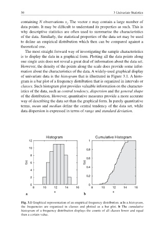
mation about the characteristics of the data. A widely-used graphical display
of univariate data is the histogram that is illustrated in Figure 3.1. A histo-
gram is a bar plot of a frequency distribution that is organized in intervals or
classes. Such histogram plot provides valuable information on the character-
istics of the data, such as central tendency, dispersion and the general shape
of the distribution. However, quantitative measures provide a more accurate
way of describing the data set than the graphical form. In purely quantitative
terms, mean and median define the central tendency of the data set, while
data dispersion is expressed in terms of range and standard deviation.
Histogram Cumulative Histogram
12 1
10
0.8
8
0.6
f(x) 6 f(x)
0.4
4
0.2
2
0 0
8 10 12 14 16 8 10 12 14 16
x x
a b
Fig. 3.1 Graphical representation of an empirical frequency distribution. a In a histogram,
the frequencies are organized in classes and plotted as a bar plot. b The cumulative
histogram of a frequency distribution displays the counts of all classes lower and equal
than a certain value.