
Page 370 - Marketing Management
P. 370
SETTING PRODUCT STRATEGY | CHAPTER 12 347
Packaging must achieve a number of objectives: 57
1. Identify the brand.
2. Convey descriptive and persuasive information.
3. Facilitate product transportation and protection.
4. Assist at-home storage.
5. Aid product consumption.
To achieve these objectives and satisfy consumers’ desires, marketers must choose the
aesthetic and functional components of packaging correctly. Aesthetic considerations re-
late to a package’s size and shape, material, color, text, and graphics. There are a number of
factors and criteria in each area.
Color is a particularly important aspect of packaging and carries different meanings
in different cultures and market segments. Table 12.3 summarizes the beliefs of
some visual marketing experts about its role.
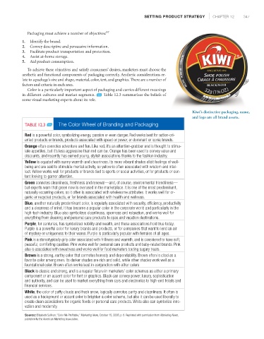
Kiwi’s distinctive packaging, name,
and logo are all brand assets.
TABLE 12.3 The Color Wheel of Branding and Packaging
Red is a powerful color, symbolizing energy, passion or even danger. Red works best for action-ori-
ented products or brands, products associated with speed or power, or dominant or iconic brands.
Orange often connotes adventure and fun. Like red, it’s an attention-grabber and is thought to stimu-
late appetites, but it’s less aggressive than red can be. Orange has been used to convey value and
discounts, and recently has earned young, stylish associations thanks to the fashion industry.
Yellow is equated with sunny warmth and cheeriness. Its more vibrant shades elicit feelings of well-
being and are said to stimulate mental activity, so yellow is often associated with wisdom and intel-
lect. Yellow works well for products or brands tied to sports or social activities, or for products or con-
tent looking to garner attention.
Green connotes cleanliness, freshness and renewal—and, of course, environmental friendliness—
but experts warn that green now is overused in the marketplace. It is one of the most predominant,
naturally occurring colors, so it often is associated with wholesome attributes. It works well for or-
ganic or recycled products, or for brands associated with health and wellness.
Blue, another naturally predominant color, is regularly associated with security, efficiency, productivity
and a clearness of mind. It has become a popular color in the corporate world and particularly in the
high-tech industry. Blue also symbolizes cleanliness, openness and relaxation, and works well for
everything from cleaning and personal care products to spas and vacation destinations.
Purple, for centuries, has symbolized nobility and wealth, and those associations hold true today.
Purple is a powerful color for luxury brands and products, or for companies that want to lend an air
of mystery or uniqueness to their wares. Purple is particularly popular with females of all ages.
Pink is a stereotypically girly color associated with frilliness and warmth, and is considered to have soft,
peaceful, comforting qualities. Pink works well for personal care products and baby-related brands. Pink
also is associated with sweetness and works well for food marketers touting sugary treats.
Brown is a strong, earthy color that connotes honesty and dependability. Brown often is cited as a
favorite color among men. Its darker shades are rich and solid, while other shades work well as a
foundational color. Brown often works best in conjunction with other colors
Black is classic and strong, and is a regular fixture in marketers’ color schemes as either a primary
component or an accent color for font or graphics. Black can convey power, luxury, sophistication
and authority, and can be used to market everything from cars and electronics to high-end hotels and
financial services.
White, the color of puffy clouds and fresh snow, logically connotes purity and cleanliness. It often is
used as a background or accent color to brighten a color scheme, but also it can be used liberally to
create clean associations for organic foods or personal care products. White also can symbolize inno-
vation and modernity.
Source: Elisabeth Sullivan, “Color Me Profitable,” Marketing News, October 15, 2008, p. 8. Reprinted with permission from Marketing News,
published by the American Marketing Association.