
Page 114 -
P. 114
CHAPTER 4 SOFTWARE PROCESS AND PROJECT METRICS 85
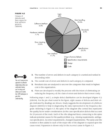
FIGURE 4.2 Logic
Causes of 20%
defects and
their origin for Data handling
four software 10.5%
projects Software interface
[GRA94] 6.0%
Standards
Hardware interface 6.9%
7.7%
Error checking
10.9%
Specifications
25.5%
User interface
11.7%
Origin of errors/defects
Specification/requirements
Design
Code
3. The number of errors and defects in each category is counted and ranked in
descending order.
You can’t improve your 4. The overall cost of errors and defects in each category is computed.
approach to software
engineering unless you 5. Resultant data are analyzed to uncover the categories that result in highest
understand where cost to the organization.
you’re strong and
where you’re weak. 6. Plans are developed to modify the process with the intent of eliminating (or
Use SSPI techniques to reducing the frequency of) the class of errors and defects that is most costly.
gain that
understanding. Following steps 1 and 2, a simple defect distribution can be developed (Figure 4.2)
[GRA94]. For the pie-chart noted in the figure, eight causes of defects and their ori-
gin (indicated by shading) are shown. Grady suggests the development of a fishbone
diagram [GRA92] to help in diagnosing the data represented in the frequency dia-
gram. Referring to Figure 4.3, the spine of the diagram (the central line) represents
the quality factor under consideration (in this case specification defects that account
for 25 percent of the total). Each of the ribs (diagonal lines) connecting to the spine
indicate potential causes for the quality problem (e.g., missing requirements, ambigu-
ous specification, incorrect requirements, changed requirements). The spine and ribs
notation is then added to each of the major ribs of the diagram to expand upon the
cause noted. Expansion is shown only for the incorrect cause in Figure 4.3.