
Page 296 - Statistics for Dummies
P. 296
280
Part V: Statistical Studies and the Hunt for a Meaningful Relationship
Picturing a Relationship
with a Scatterplot
An article in Garden Gate magazine caught my eye: “Count Cricket Chirps to
Gauge Temperature.” According to the article, all you have to do is find a
cricket, count the number of times it chirps in 15 seconds, add 40, and voilà!
You’ve just estimated the temperature in Fahrenheit.
The National Weather Service Forecast Office even puts out its own “Cricket
Chirp Converter.” You enter the number of cricket chirps recorded in 15 sec-
onds, and the converter gives you the estimated temperature in four different
units, including Fahrenheit and Celsius.
A fair amount of research does support the claim that frequency of cricket
chirps is related to temperature. For the purpose of illustration I’ve taken
only a subset of some of the data (see Table 18-1).
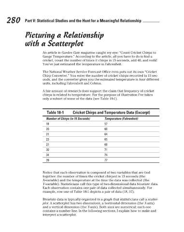
Table 18-1 Cricket Chirps and Temperature Data (Excerpt)
Number of Chirps (in 15 Seconds) Temperature (Fahrenheit)
18 57
20 60
21 64
23 65
27 68
30 71
34 74
39 77
Notice that each observation is composed of two variables that are tied
together: the number of times the cricket chirped in 15 seconds (the
X-variable) and the temperature at the time the data was collected (the
Y-variable). Statisticians call this type of two-dimensional data bivariate data.
Each observation contains one pair of data collected simultaneously. For
example, row one of Table 18-1 depicts a pair of data (18, 57).
Bivariate data is typically organized in a graph that statisticians call a scatter-
plot. A scatterplot has two dimensions, a horizontal dimension (the X-axis)
and a vertical dimension (the Y-axis). Both axes are numerical; each one
contains a number line. In the following sections, I explain how to make and
interpret a scatterplot.
3/25/11 8:13 PM
26_9780470911082-ch18.indd 280 3/25/11 8:13 PM
26_9780470911082-ch18.indd 280