
Page 297 - Statistics for Dummies
P. 297
Making a scatterplot
Placing observations (or points) on a scatterplot is similar to playing the game
Battleship. Each observation has two coordinates; the first corresponds to the
first piece of data in the pair (that’s the X coordinate; the amount that you go
left or right). The second coordinate corresponds to the second piece of data
in the pair (that’s the Y-coordinate; the amount that you go up or down). You
place the point representing that observation at the intersection of the two
coordinates.
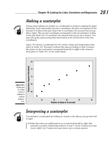
Figure 18-1 shows a scatterplot for the cricket chirps and temperature data
listed in Table 18-1. Because I ordered the data according to their X-values,
the points on the scatterplot correspond from left to right to the observa-
tions given in Table 18-1, in the order listed.
80 Chapter 18: Looking for Links: Correlation and Regression 281
Temperature (degrees Fahrenheit) 70
75
Figure 18-1: 65
Scatterplot
of cricket
chirps in 60
relation to
outdoor
tempera- 20 25 30 35 40
ture. Number of chirps in 15 seconds
Interpreting a scatterplot
You interpret a scatterplot by looking for trends in the data as you go from left
to right:
✓ If the data show an uphill pattern as you move from left to right, this
indicates a positive relationship between X and Y. As the X-values increase
(move right), the Y-values increase (move up) a certain amount.
3/25/11 8:13 PM
26_9780470911082-ch18.indd 281 3/25/11 8:13 PM
26_9780470911082-ch18.indd 281