
Page 55 - Statistics for Dummies
P. 55
Chapter 3: Taking Control: So Many Numbers, So Little Time
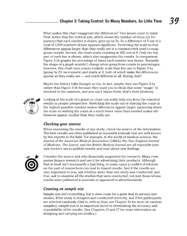
What makes this chart exaggerate the differences? Two issues come to mind.
First, notice that the vertical axis, which shows the number of times (or fre-
quency) that each number is drawn, goes up by 5s. So a difference of 5 out of a
total of 4,839 numbers drawn appears significant. Stretching the scale so that
differences appear larger than they really are is a common trick used to exag-
gerate results. Second, the chart starts counting at 465, not at 0. Only the top
part of each bar is shown, which also exaggerates the results. In comparison,
Figure 3-1b graphs the percentage of times each number was drawn. Normally
the shape of a graph wouldn’t change when going from counts to percentages;
however, this chart uses a more realistic scale than the one in Figure 3-1a
(going by 2% increments) and starts at 0, both of which make the differences
appear as they really are — not much different at all. Boring, huh?
Maybe the lottery folks thought so too. In fact, maybe they use Figure 3-1a
rather than Figure 3-1b because they want you to think that some “magic” is
involved in the numbers, and you can’t blame them; that’s their business.
Looking at the scale of a graph or chart can really help you keep the reported 39
results in proper perspective. Stretching the scale out or starting the y-axis at
the highest possible number makes differences appear larger; squeezing down
the scale or starting the y-axis at a much lower value than needed makes dif-
ferences appear smaller than they really are.
Checking your sources
When examining the results of any study, check the source of the information.
The best results are often published in reputable journals that are well known
by the experts in the field. For example, in the world of medical science, the
Journal of the American Medical Association (JAMA), the New England Journal
of Medicine, The Lancet, and the British Medical Journal are all reputable jour-
nals doctors use to publish results and read about new findings.
Consider the source and who financially supported the research. Many com-
panies finance research and use it for advertising their products. Although
that in itself isn’t necessarily a bad thing, in some cases a conflict of interest
on the part of researchers can lead to biased results. And if the results are
very important to you, ask whether more than one study was conducted, and
if so, ask to examine all the studies that were conducted, not just those whose
results were published in journals or appeared in advertisements.
Counting on sample size
Sample size isn’t everything, but it does count for a great deal in surveys and
studies. If the study is designed and conducted correctly, and if the participants
are selected randomly (that is, with no bias; see Chapter 16 for more on random
samples), sample size is an important factor in determining the accuracy and
repeatability of the results. (See Chapters 16 and 17 for more information on
designing and carrying out studies.)
3/25/11 8:17 PM
07_9780470911082-ch03.indd 39 3/25/11 8:17 PM
07_9780470911082-ch03.indd 39