
Page 86 - Bruce Ellig - The Complete Guide to Executive Compensation (2007)
P. 86
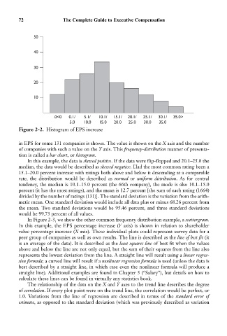
72                The Complete Guide to Executive Compensation


                  50


                  40


                  30


                  20


                  10


                          .0<0  0.1/  5.1/  10.1/  15.1/  20.1/  25.1/  30.1/  35.0>
                                5.0   10.0   15.0  20.0  25.0  30.0  35.0
            Figure 2-2. Histogram of EPS increase

            in EPS for some 131 companies is shown. The value is shown on the X axis and the number
            of companies with such a value on the Y axis. This frequency-distribution manner of presenta-
            tion is called a bar chart, or histogram.
               In this example, the data is skewed positive. If the data were flip-flopped and 20.1–25.0 the
            median, the data would be described as skewed negative. Had the most common rating been a
            15.1–20.0 percent increase with ratings both above and below it descending at a comparable
            rate, the distribution would be described as  normal or  uniform distribution. As for central
            tendency, the median is 10.1–15.0 percent (the 66th company), the mode is also 10.1–15.0
            percent (it has the most ratings), and the mean is 12.7 percent [the sum of each rating (1664)
            divided by the number of ratings (131)]. The standard deviation is the variation from the arith-
            metic mean. One standard deviation would include all data plus or minus 68.26 percent from
            the mean. Two standard deviations would be 95.46 percent, and three standard deviations
            would be 99.73 percent of all values.
               In Figure 2-3, we show the other common frequency distribution example, a scattergram.
            In this example, the EPS percentage increase (Y axis) is shown in relation to shareholder
            value percentage increase (X axis). These individual plots could represent survey data for a
            peer group of companies as well as own results. The line is described as the line of best fit (it
            is an average of the data). It is described as the least squares line of best fit when the values
            above and below the line are not only equal, but the sum of their squares from the line also
            represents the lowest deviation from the line. A straight line will result using a linear regres-
            sion formula; a curved line will result if a nonlinear regression formula is used (unless the data is
            best described by a straight line, in which case even the nonlinear formula will produce a
            straight line). Additional examples are found in Chapter 5 (“Salary”), but details on how to
            calculate these lines can be found in virtually any statistics book.
               The relationship of the data on the X and Y axes to the trend line describes the degree
            of correlation. If every plot point were on the trend line, the correlation would be perfect, or
            1.0. Variations from the line of regression are described in terms of the standard error of
            estimate, as opposed to the standard deviation (which was previously described as variation