
Page 178 - The Creative Training Idea Book Inspired Tips and Techniques for Engaging and Effective Learning
P. 178
lucas chap 05 11/20/02 12:13 PM Page 167
Creating a Stimulating Learning Environment 167
1950s, white (symbolizing cleanliness and purity) was selected for the detergent and
bright orange (bold, bright, powerful) was chosen to contrast with the gold (rich, valu-
able) on the package.
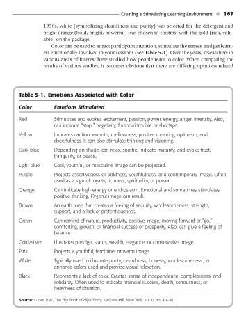
Color can be used to attract participant attention, stimulate the senses, and get learn-
ers emotionally involved in your sessions (see Table 5-1). Over the years, researchers in
various areas of interest have studied how people react to color. When comparing the
results of various studies, it becomes obvious that there are differing opinions related
Table 5-1. Emotions Associated with Color
Color Emotions Stimulated
Red Stimulates and evokes excitement, passion, power, energy, anger, intensity. Also,
can indicate “stop,” negativity, financial trouble or shortage.
Yellow Indicates caution, warmth, mellowness, positive meaning, optimism, and
cheerfulness. It can also stimulate thinking and visioning.
Dark blue Depending on shade, can relax, soothe, indicate maturity, and evoke trust,
tranquility, or peace.
Light blue Cool, youthful, or masculine image can be projected.
Purple Projects assertiveness or boldness, youthfulness, and contemporary image. Often
used as a sign of royalty, richness, spirituality, or power.
Orange Can indicate high energy or enthusiasm. Emotional and sometimes stimulates
positive thinking. Organic image can result.
Brown An earth tone that creates a feeling of security, wholesomeness, strength,
support, and a lack of pretentiousness.
Green Can remind of nature, productivity, positive image, moving forward or “go,”
comforting, growth, or financial success or prosperity. Also, can give a feeling of
balance.
Gold/silver Illustrates prestige, status, wealth, elegance, or conservative image.
Pink Projects a youthful, feminine, or warm image.
White Typically used to illustrate purity, cleanliness, honesty, wholesomeness; to
enhance colors used and provide visual relaxation.
Black Represents a lack of color. Creates sense of independence, completeness, and
solidarity. Often used to indicate financial success, death, seriousness, or
heaviness of situation.
Source: Lucas, R.W., The Big Book of Flip Charts, McGraw-Hill, New York, 2000, pp. 40–41.