
Page 296 - The Creative Training Idea Book Inspired Tips and Techniques for Engaging and Effective Learning
P. 296
lucas chap 08 11/20/02 12:50 PM Page 285
Making Your Visual Message Sizzle 285
Spray them with artist’s adhesive, and then practice placing them at various loca-
tions on your page. Next, try adding some lettering and move your images around.
Text should be evenly spaced and start at the same position on each page to
present a uniform appearance. To maintain visual balance, consider leaving the
same margin on all sides of text, for example, 2 inches from the top and bottom
edges of paper and 2 inches from the left and right edges. When adding graphics,
keep their size in proportion to the rest of the information shown.
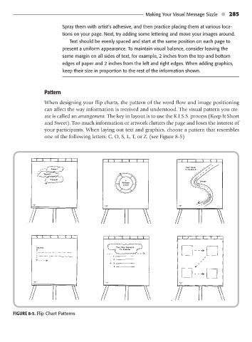
Pattern
When designing your flip charts, the pattern of the word flow and image positioning
can affect the way information is received and understood. The visual pattern you cre-
ate is called an arrangement. The key in layout is to use the K.I.S.S. process (Keep It Short
and Sweet). Too much information or artwork clutters the page and loses the interest of
your participants. When laying out text and graphics, choose a pattern that resembles
one of the following letters: C, O, S, L, T, or Z. (see Figure 8-5)
Your Road
Power! To Reduced
Impact!
Pizzazz! 6 Stress
Primary
colors
”C“
”O“ ”S“
Success Four Key Concepts
is . . . To Consider
1.
2.
3.
4.
”L“ ”T“ ”Z“
FIGURE 8-5. Flip Chart Patterns