
Page 293 - The Creative Training Idea Book Inspired Tips and Techniques for Engaging and Effective Learning
P. 293
lucas chap 08 11/20/02 12:50 PM Page 282
282 The Creative Training Idea Book
Design Considerations
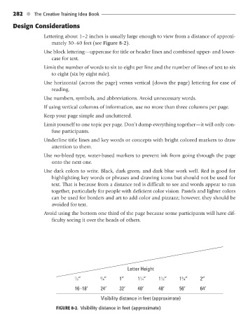
Lettering about 1–2 inches is usually large enough to view from a distance of approxi-
mately 30–60 feet (see Figure 8-2).
Use block lettering—uppercase for title or header lines and combined upper- and lower-
case for text.
Limit the number of words to six to eight per line and the number of lines of text to six
to eight (six by eight rule).
Use horizontal (across the page) versus vertical (down the page) lettering for ease of
reading.
Use numbers, symbols, and abbreviations. Avoid unnecessary words.
If using vertical columns of information, use no more than three columns per page.
Keep your page simple and uncluttered.
Limit yourself to one topic per page. Don’t dump everything together—it will only con-
fuse participants.
Underline title lines and key words or concepts with bright colored markers to draw
attention to them.
Use no-bleed type, water-based markers to prevent ink from going through the page
onto the next one.
Use dark colors to write. Black, dark green, and dark blue work well. Red is good for
highlighting key words or phrases and drawing icons but should not be used for
text. That is because from a distance red is difficult to see and words appear to run
together, particularly for people with deficient color vision. Pastels and lighter colors
can be used for borders and art to add color and pizzazz; however, they should be
avoided for text.
Avoid using the bottom one third of the page because some participants will have dif-
ficulty seeing it over the heads of others.
Letter Height
1
1
1 /2″ 3 /4″ 1″ 1 /4″ 1 /2″ 1 /4″ 2″
3
16–18′ 24′ 32′ 40′ 48′ 56′ 64′
Visibility distance in feet (approximate)
FIGURE 8-2. Visibility distance in feet (approximate)