
Page 17 - Applied Numerical Methods Using MATLAB
P. 17
6 MATLAB USAGE AND COMPUTATIONAL ERRORS
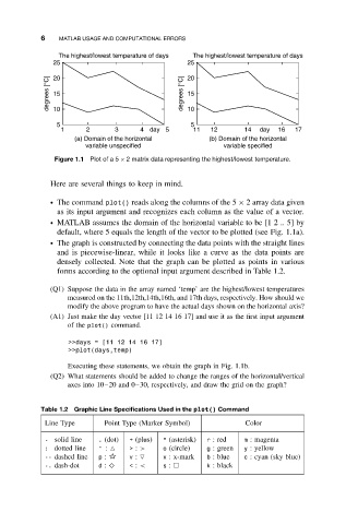
The highest/lowest temperature of days The highest/lowest temperature of days
25 25
degrees [°C] 20 degrees [°C] 20
15
15
10
10
5 5
1 2 3 4 day 5 11 12 14 day 16 17
(a) Domain of the horizontal (b) Domain of the horizontal
variable unspecified variable specified
Figure 1.1 Plot of a 5 × 2 matrix data representing the highest/lowest temperature.
Here are several things to keep in mind.
ž The command plot() reads along the columns of the 5 × 2 array data given
as its input argument and recognizes each column as the value of a vector.
ž MATLAB assumes the domain of the horizontal variable to be [1 2 .. 5] by
default, where 5 equals the length of the vector to be plotted (see Fig. 1.1a).
ž The graph is constructed by connecting the data points with the straight lines
and is piecewise-linear, while it looks like a curve as the data points are
densely collected. Note that the graph can be plotted as points in various
forms according to the optional input argument described in Table 1.2.
(Q1) Suppose the data in the array named ‘temp’ are the highest/lowest temperatures
measured on the 11th,12th,14th,16th, and 17th days, respectively. How should we
modify the above program to have the actual days shown on the horizontal axis?
(A1) Just make the day vector [11 12 14 16 17] and use it as the first input argument
of the plot() command.
>>days = [11 12 14 16 17]
>>plot(days,temp)
Executing these statements, we obtain the graph in Fig. 1.1b.
(Q2) What statements should be added to change the ranges of the horizontal/vertical
axes into 10–20 and 0–30, respectively, and draw the grid on the graph?
Table 1.2 Graphic Line Specifications Used in the plot() Command
Line Type Point Type (Marker Symbol) Color
- solid line . (dot) + (plus) * (asterisk) r :red m : magenta
: dotted line ^ : > : > o (circle) g : green y : yellow
-- dashed line p : v : x :x-mark b :blue c :cyan(skyblue)
-. dash-dot d : ♦ < : < s : k : black