
Page 397 - Excel 2007 Bible
P. 397
25_044039 ch19.qxp 11/21/06 11:10 AM Page 354
Part III
Creating Charts and Graphics
Parts of a Chart
R
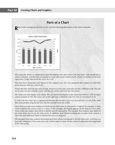
efer to the accompanying chart as you read the following description of the chart’s elements.
This particular chart is a combination chart that displays two data series: Calls and Sales. Calls are plotted as
vertical columns, and the Sales are plotted as a line with round markers. Each column (or marker on the line)
represents a single data point (the value in a cell).
The chart has a horizontal axis, known as the category axis. This axis represents the category for each data
point (January, February, and so on).
Notice that this chart has two vertical axes, known as value axes, and each one has a different scale. The axis
on the left is for the columns (Calls), and the axis on the right is for the line (Sales).
The value axes also display scale values. The axis on the left displays scale values from 500 to 1,200, in major
unit increments of 100. The value axis on the right uses a different scale: 0 to 100, in increments of 10.
A chart with two value axes is appropriate because the two data series vary dramatically in scale. If the Sales
data were plotted using the left axis, the line wouldn’t even be visible.
Most charts provide some method of identifying the data series or data points. A legend, for example, is often
used to identify the various series in a chart. In this example, the legend appears on the bottom of the chart.
Some charts also display data labels to identify specific data points. The example chart displays data labels for
the Calls series, but not for the Sales series. In addition, most charts (including the example chart) contain a
chart title and additional labels to identify the axes or categories.
The example chart also contains horizontal grid lines (which correspond to the left value axis). Grid lines are
basically extensions of the value axis scale, which makes it easier for the viewer to determine the magnitude
of the data points.
354