
Page 401 - Excel 2007 Bible
P. 401
25_044039 ch19.qxp 11/21/06 11:10 AM Page 358
Part III
Creating Charts and Graphics
The chart title is a text element that you can select and edit. Alternatively, you can link the chart title to a
cell so the title always displays the contents of a particular cell. To create a link to a cell, click the chart title,
type an equal sign (=), and click the cell. Excel displays the link in the Formula bar. In the example, the
contents of cell A1 is perfect for the chart title.
Experiment with the Chart Tools ➪ Layout tab to make other changes to the chart. For example, you can
remove the grid lines, add axis titles, relocate the legend, and so on. Making these changes is easy and
intuitive.
Trying another view of the data
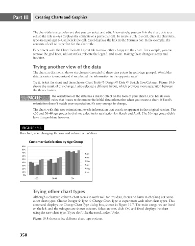
The chart, at this point, shows six clusters (months) of three data points in each (age groups). Would the
data be easier to understand if we plotted the information in the opposite way?
Try it. Select the chart and then choose Chart Tools ➪ Design ➪ Data ➪ Switch Row/Column. Figure 19.6
shows the result of this change. I also selected a different layout, which provides more separation between
the three clusters.
The orientation of the data has a drastic effect on the look of your chart. Excel has its own
NOTE
NOTE
rules that it uses to determine the initial data orientation when you create a chart. If Excel’s
orientation doesn’t match your expectation, it’s easy enough to change.
The chart, with this new orientation, reveals information that wasn’t so apparent in the original version. The
<30 and 30-49 age groups both show a decline in satisfaction for March and April. The 50+ age group didn’t
have this problem, however.
FIGURE 19.6
The chart, after changing the row and column orientation.
Trying other chart types
Although a clustered column chart seems to work well for this data, there’s no harm in checking out some
other chart types. Choose Design ➪ Type ➪ Change Chart Type to experiment with other chart types. This
command displays the Change Chart Type dialog box, shown in Figure 19.7. The main categories are listed
on the left, and the subtypes are shown as icons. Select an icon, click OK, and Excel displays the chart
using the new chart type. If you don’t like the result, select Undo.
Figure 19.8 shows a few different chart type options.
358