
Page 168 - Excel Data Analysis
P. 168
09 537547 Ch08.qxd 3/4/03 12:06 PM Page 154
EXCEL DATA ANALYSIS
ADD A DATA TABLE TO A PIVOTCHART
hen analyzing data using a PivotChart, you can Excel frequently uses the Category axis as the column
make the data easier to interpret if you know labels for the data table. For example, if you use the
W what values display on the chart. If you want to default PivotChart chart type of a stacked column chart,
see the exact value of each data point on a PivotChart, you Excel attaches the data table to the Categories axis with the
can include a data table. A data table contains all numeric axis labels also being the column headings. However, if you
values shown on a PivotChart. Excel typically places the create any type of bar chart, the data table becomes a
data table at the bottom of the chart sheet. separate element in the chart.
When you add a data table to an Excel chart, you have the Data tables dynamically update when you change the
option of displaying the legend keys next to the row labels values displayed on the PivotChart. For example, if you
in the table. The Legend keys are the colored squares that are analyzing the sales in different states within your
display next to each value name to identify how the value organization, and you specify that you only want to view
appears on the chart. If you select this option, the same sales from California, Texas, and Florida, Excel updates the
keys on the Legend appear in the data table, making the data table to show only those values.
use of the Legend redundant on the PivotChart. Therefore,
if you decide to use a data table, you should consider
removing the Legend from the PivotChart display.
ADD A DATA TABLE TO A PIVOTCHART
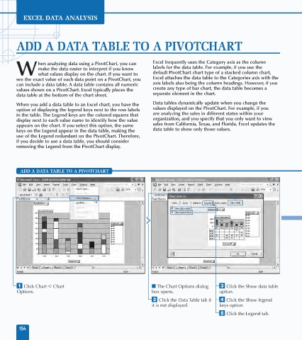
⁄ Click Chart ➪ Chart ■ The Chart Options dialog ‹ Click the Show data table
Options. box opens. option.
¤ Click the Data Table tab if › Click the Show legend
it is not displayed. keys option.
ˇ Click the Legend tab.
154