Page 169 - Excel Data Analysis
P. 169

09 537547 Ch08.qxd  3/4/03  12:06 PM  Page 155


                                                                                  CREATING PIVOTCHARTS 8


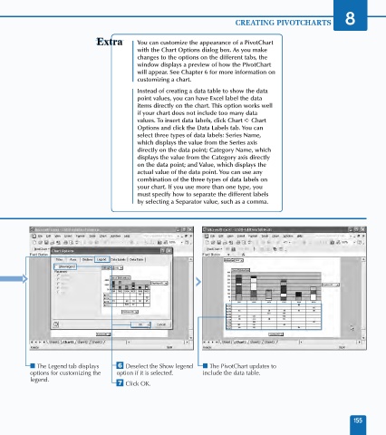
                                                     You can customize the appearance of a PivotChart
                                                     with the Chart Options dialog box. As you make
                                                     changes to the options on the different tabs, the
                                                     window displays a preview of how the PivotChart
                                                     will appear. See Chapter 6 for more information on
                                                     customizing a chart.
                                                     Instead of creating a data table to show the data
                                                     point values, you can have Excel label the data
                                                     items directly on the chart. This option works well
                                                     if your chart does not include too many data
                                                     values. To insert data labels, click Chart ➪ Chart
                                                     Options and click the Data Labels tab. You can
                                                     select three types of data labels: Series Name,
                                                     which displays the value from the Series axis
                                                     directly on the data point; Category Name, which
                                                     displays the value from the Category axis directly
                                                     on the data point; and Value, which displays the
                                                     actual value of the data point. You can use any
                                                     combination of the three types of data labels on
                                                     your chart. If you use more than one type, you
                                                     must specify how to separate the different labels
                                                     by selecting a Separator value, such as a comma.


                     ■ The Legend tab displays   Á Deselect the Show legend   ■ The PivotChart updates to
                     options for customizing the   option if it is selected.  include the data table.
                     legend.
                                              ‡ Click OK.


                                                                                                                     155
   164   165   166   167   168   169   170   171   172   173   174