
Page 265 - Fundamentals of Probability and Statistics for Engineers
P. 265
248 Fundamentals of Probability and Statistics for Engineers
8.1 HISTOGRAM AND FREQUENCY DIAGRAMS
Given a set of independent observations x 1 , x 2 , .. ., and x n of a random variable
X, a useful first step is to organize and present them properly so that they can
be easily interpreted and evaluated. When there are a large number of observed
data, a histogram is an excellent graphical representation of the data, facilitating
(a)an evaluation ofadequacyofthe assumed model, (b)estimation ofpercentiles
of the distribution, and (c) estimation of the distribution parameters.
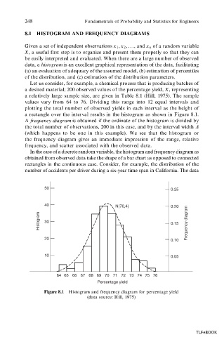
Let us consider, for example, a chemical process that is producing batches of
a desired material; 200 observed values of the percentage yield, X, representing
a relatively large sample size, are given in Table 8.1 (Hill, 1975). The sample
values vary from 64 to 76. Dividing this range into 12 equal intervals and
plotting the total number of observed yields in each interval as the height of
a rectangle over the interval results in the histogram as shown in Figure 8.1.
A frequency diagram is obtained if the ordinate of the histogram is divided by
the total number of observations, 200 in this case, and by the interval width D
(which happens to be one in this example). We see that the histogram or
the frequency diagram gives an immediate impression of the range, relative
frequency, and scatter associated with the observed data.
In the case of a discrete random variable, the histogram and frequency diagram as
obtained from observed data take the shape of a bar chart as opposed to connected
rectangles in the continuous case. Consider, for example, the distribution of the
number of accidents per driver during a six-year time span in California. The data
50 0.25
40 N(70,4) 0.20
Histogram 30 0.15 Frequency diagram
20
0.10
10 0.05
64 65 66 67 68 69 70 71 72 73 74 75 76
Percentage yield
Figure 8.1 Histogram and frequency diagram for percentage yield
(data source: Hill, 1975)
TLFeBOOK