
Page 230 - Intelligent Digital Oil And Gas Fields
P. 230
Workflow Automation and Intelligent Control 181
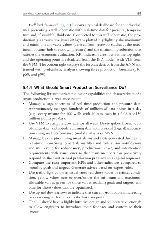
Well level dashboard. Fig. 5.18 shows a typical dashboard for an individual
well presenting a well schematic with real-time data for pressure, tempera-
ture and, if available, fluid rate. Connected to this well schematic, the pro-
duction plot versus the latest 30days is plotted highlighting the maximum
and minimum allowable values (derived from reservoir studies at the max-
imum bottom-hole drawdown pressure) and the minimum production that
satisfies the economic evaluation. KPI indicators are shown at the top right,
and the operating point is calculated from the IPR model, with VLP from
the VFM. The bottom right displays the forecast derived from the ANN and
trained with probabilistic analysis showing three production forecasts (p10,
p50, and p90).
5.4.4 What Should Smart Production Surveillance Do?
The following list summarizes the major capabilities and characteristics of a
smart production surveillance system:
• Manage a large spectrum of real-time production and pressure data.
Approximately manages hundreds of millions of data points in a day
(e.g., every minute for 100 wells with 40 tags, each in a field is >150
million points per day).
• Use VFM to compute flow rate for all wells. Delete spikes, frozen, out-
of-range data, and populate missing data with physical (logical) informa-
tion using well performance (nodal analysis) or ANN.
• Manage by exception using smart alarms and alerts generated during the
real-time monitoring. Smart alarms filter and rank sensor notifications
and well events for redundancy, production impact, and intervention
requirements with visual cues so that team members can proactively
respond to the most critical production problems in a logical sequence.
• Compute the most important KPIs and other indicators compared to
monthly goals and targets. Generate advice based on expert rules.
• Use traffic-light colors as visual cues: red those values in critical condi-
tion, yellow values near or over/under the minimum and maximum
allowable values, green for those values reaching goals and targets, and
blue for those values that are optimized.
• Use up and down arrows to indicate that current production is increasing
or decreasing with respect to the last data point.
• The UI should have a highly intuitive design and be interactive enough
to allow engineers to introduce their feedback and customize their
layout.