
Page 179 -
P. 179
148 Chapter 5 Understanding how interfaces affect users
Provide specific examples for each of the above categories from your own experience, when
you have become frustrated with an interactive device (e.g., telephone, VCR, vending ma-
chine, PDA, computer). In doing this, write down any further types of frustration that come
to mind. Then prioritize them in terms of how annoying they are. What are the worst types?
Comment In the text below we provide examples of common frustrations experienced when using
computer systems. The worst include unhelpful error messages and excessive housekeeping
tasks. You no doubt came up with many more.
Often user frustration is caused by bad design, no design, inadvertent design, or
ill-thought-out design. It is rarely caused deliberately. However, its impact on users
can be quite drastic and make them abandon the application or tool. Here, we pre-
sent some examples of classic user-frustration provokers that could be avoided or
reduced by putting more thought into the design of the conceptual model.
1. Gimmicks
Cause: When a users' expectations are not met and they are instead presented with
a gimmicky display.
Level of frustration: Mild
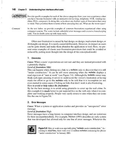
This can happen when clicking on a link to a website only to discover that it is still
"under construction." It can be still more annoying when the website displays a
road-sign icon of "men at work" (see Figure 5.6). Although the website owner may
think such signs amusing, it serves to underscore the viewer's frustration at having
made the effort to go to the website only to be told that it is incomplete (or not
even started in some cases). Clicking on links that don't work is also frustrating.
How to avoid or help reduce the frustration:
By far the best strategy is to avoid using gimmicks to cover up the real crime. In
this example it is much better to put material live on the web only when it is com-
plete and working properly. People very rarely return to sites when they see icons
like the one in Figure 5.6.
2. Error Messages
Cause: When a system or application crashes and provides an "unexpected" error
message.
Level of frustration: High
Error messages have a long history in computer interface design, and are notorious
for their incomprehensibility. For example, Nielsen (1993) describes an early system
that was developed that allowed only for one line of error messages. Whenever the
Figure 5.6 Men at work icon sign indicating "website under construction." Ac-
cording to AltaVista, there were over 12 million websites containing the phrase
"under construction" in January 2001.