
Page 89 -
P. 89
58 Chapter 2 Understanding and conceptualizing interaction
not matter whether rules are contravened. Once people understand why the bin is
on the desktop, they readily accept that the real-world rule had to be broken.
Moreover, the unexpected juxtaposition of the bin on the desktop can draw to the
user's attention the additional functionality that it provides.
Too constraining. Another argument against interface metaphors is that they
are too constraining, restricting the kinds of computational tasks that would be
useful at the interface. An example is trying to open a file that is embedded in
several hundreds of files in a directory. Having to scan through hundreds of icons
on a desktop or scroll through a list of files seems a very inefficient way of doing
this. As discussed earlier, a better way is to allow the user to instruct the computer
to open the desired file by typing in its name (assuming they can remember the
name of the file).
Conflicts with design principles. By trying to design the interface metaphor to
fit in with the constraints of the physical world, designers are forced into making
bad design solutions that conflict with basic design principles. Ted Nelson sets up
the trash can again as an example of such violation: "a hideous failure of consis-
tency is the garbage can on the Macintosh, which means either "destroy this" or
"eject it for safekeeping" (Nelson, 1990).
Not being able to understand the system functionality beyond the metaphor. It
has been argued that users may get fixed in their understanding of the system based
on the interface metaphor. In so doing, they may find it difficult to see what else
can be done with the system beyond the actions suggested by the interface
metaphor. Nelson (1990) also argues that the similarity of interface metaphors to
any real objects in the world is so tenuous that it gets in the way more than it helps.
We would argue the opposite: because the link is tenuous and there are only a cer-
tain number of similarities, it enables the user to see both the dissimilarities and
how the metaphor has been extended.
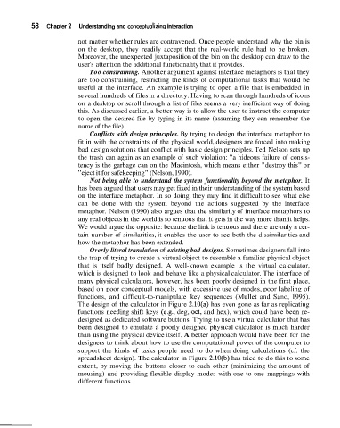
Overly literal translation of existing bad designs. Sometimes designers fall into
the trap of trying to create a virtual object to resemble a familiar physical object
that is itself badly designed. A well-known example is the virtual calculator,
which is designed to look and behave like a physical calculator. The interface of
many physical calculators, however, has been poorly designed in the first place,
based on poor conceptual models, with excessive use of modes, poor labeling of
functions, and difficult-to-manipulate key sequences (Mullet and Sano, 1995).
The design of the calculator in Figure 2.10(a) has even gone as far as replicating
functions needing shift keys (e.g., deg, oct, and hex), which could have been re-
designed as dedicated software buttons. Trying to use a virtual calculator that has
been designed to emulate a poorly designed physical calculator is much harder
than using the physical device itself. A better approach would have been for the
designers to think about how to use the computational power of the computer to
support the kinds of tasks people need to do when doing calculations (cf. the
spreadsheet design). The calculator in Figure 2.10(b) has tried to do this to some
extent, by moving the buttons closer to each other (minimizing the amount of
mousing) and providing flexible display modes with one-to-one mappings with
different functions.