
Page 101 - Intermediate Statistics for Dummies
P. 101
09_045206 ch04.qxd 2/1/07 9:49 AM Page 80
80
Part II: Making Predictions by Using Regression
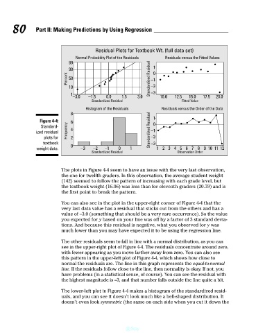
Residual Plots for Textbook Wt. (full data set)
Normal Probability Plot of the Residuals
90
50
−2
10
−3
20.0
12.5
17.5
15.0
0.0
−1.5
1.5
Fitted Value
Standardized Residual
Residuals versus the Order of the Data
Figure 4-4:
Standard-
−1
ized residual
−2
plots for
−3
textbook Percent Frequency 99 1 8 6 4 2 −3.0 Histogram of the Residuals 3.0 Standardized Residual Standardized Residual −1 1 0 1 0 10.0 Residuals versus the Fitted Values
0
weight data. −3 −2 −1 0 1 1 234567 8 9 10 11 12
Standardized Residual Observation Order
The plots in Figure 4-4 seem to have an issue with the very last observation,
the one for twelfth graders. In this observation, the average student weight
(142) seemed to follow the pattern of increasing with each grade level, but
the textbook weight (16.06) was less than for eleventh graders (20.79) and is
the first point to break the pattern.
You can also see in the plot in the upper-right corner of Figure 4-4 that the
very last data value has a residual that sticks out from the others and has a
value of –3.0 (something that should be a very rare occurrence). So the value
you expected for y based on your line was off by a factor of 3 standard devia-
tions. And because this residual is negative, what you observed for y was
much lower than you may have expected it to be using the regression line.
The other residuals seem to fall in line with a normal distribution, as you can
see in the upper-right plot of Figure 4-4. The residuals concentrate around zero,
with fewer appearing as you move farther away from zero. You can also see
this pattern in the upper-left plot of Figure 4-4, which shows how close to
normal the residuals are. The line in this graph represents the equal-to-normal
line. If the residuals follow close to the line, then normality is okay. If not, you
have problems (in a statistical sense, of course). You can see the residual with
the highest magnitude is –3, and that number falls outside the line quite a bit.
The lower-left plot in Figure 4-4 makes a histogram of the standardized resid-
uals, and you can see it doesn’t look much like a bell-shaped distribution. It
doesn’t even look symmetric (the same on each side when you cut it down the
@Spy