
Page 131 - Intermediate Statistics for Dummies
P. 131
11_045206 ch06.qxd 2/1/07 9:52 AM Page 110
110
Part II: Making Predictions by Using Regression
Examining scatterplots and correlations
After you’ve identified a set of possible x variables, the next step is to find
out which of these variables are highly related to y in order to start trimming
down the set of possible candidates for the final model. In the punt distance
example, the goal is to see which of the six variables in Table 6-1 are strongly
related to punt distance. The two ways to look at these relationships are the
following:
Scatterplots: A graphical technique
Correlation: A one-number measure of the linear relationship between
two variables
Both of these elements are important, and I discuss each of them in the fol-
lowing sections.
Seeing relationships through scatterplots
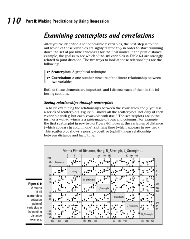
To begin examining the relationships between the x variables and y, you use
a series of scatterplots. Figure 6-1 shows all the scatterplots, not only of each
x variable with y, but each x variable with itself. The scatterplots are in the
form of a matrix, which is a table made of rows and columns. For example,
the first scatterplot in row two of Figure 6-1 looks at the variables of distance
(which appears in column one) and hang time (which appears in row two).
This scatterplot shows a possible positive (uphill) linear relationship
between distance and hang time.
Matrix Plot of Distance, Hang, R_Strength, L_Strength . . .
3 4 5 120 150 180 80 90 100
200
150 Distance
100 5
Hang 4
180 3
150
R_Strength
120
Figure 6-1: 180
A matrix L_Strength 150
of all 110 120
scatterplots 100
R_Flexibility
between 90
pairs of 100
L_Flexibility 90
variables in
80
the punting 250
200 O_Strength
distance
150
example.
100 150 200 120 150 180 90 100 110 150 200 250