
Page 132 - Intermediate Statistics for Dummies
P. 132
11_045206 ch06.qxd 2/1/07 9:52 AM Page 111
Chapter 6: One Step Forward and Two Steps Back: Regression Model Selection
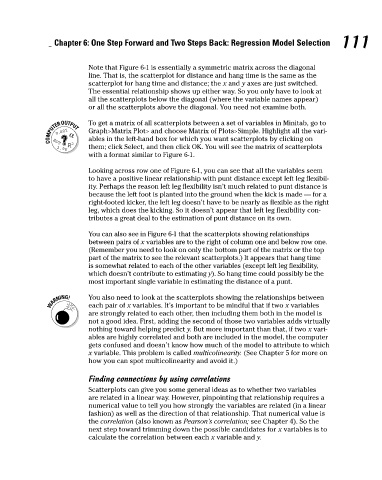
Note that Figure 6-1 is essentially a symmetric matrix across the diagonal
line. That is, the scatterplot for distance and hang time is the same as the
scatterplot for hang time and distance; the x and y axes are just switched.
The essential relationship shows up either way. So you only have to look at
all the scatterplots below the diagonal (where the variable names appear)
or all the scatterplots above the diagonal. You need not examine both.
To get a matrix of all scatterplots between a set of variables in Minitab, go to
Graph>Matrix Plot> and choose Matrix of Plots>Simple. Highlight all the vari-
ables in the left-hand box for which you want scatterplots by clicking on
them; click Select, and then click OK. You will see the matrix of scatterplots
with a format similar to Figure 6-1.
Looking across row one of Figure 6-1, you can see that all the variables seem
to have a positive linear relationship with punt distance except left leg flexibil-
ity. Perhaps the reason left leg flexibility isn’t much related to punt distance is
because the left foot is planted into the ground when the kick is made — for a
right-footed kicker, the left leg doesn’t have to be nearly as flexible as the right 111
leg, which does the kicking. So it doesn’t appear that left leg flexibility con-
tributes a great deal to the estimation of punt distance on its own.
You can also see in Figure 6-1 that the scatterplots showing relationships
between pairs of x variables are to the right of column one and below row one.
(Remember you need to look on only the bottom part of the matrix or the top
part of the matrix to see the relevant scatterplots.) It appears that hang time
is somewhat related to each of the other variables (except left leg flexibility,
which doesn’t contribute to estimating y). So hang time could possibly be the
most important single variable in estimating the distance of a punt.
You also need to look at the scatterplots showing the relationships between
each pair of x variables. It’s important to be mindful that if two x variables
are strongly related to each other, then including them both in the model is
not a good idea. First, adding the second of those two variables adds virtually
nothing toward helping predict y. But more important than that, if two x vari-
ables are highly correlated and both are included in the model, the computer
gets confused and doesn’t know how much of the model to attribute to which
x variable. This problem is called multicolinearity. (See Chapter 5 for more on
how you can spot multicolinearity and avoid it.)
Finding connections by using correlations
Scatterplots can give you some general ideas as to whether two variables
are related in a linear way. However, pinpointing that relationship requires a
numerical value to tell you how strongly the variables are related (in a linear
fashion) as well as the direction of that relationship. That numerical value is
the correlation (also known as Pearson’s correlation; see Chapter 4). So the
next step toward trimming down the possible candidates for x variables is to
calculate the correlation between each x variable and y.