
Page 93 - Intermediate Statistics for Dummies
P. 93
09_045206 ch04.qxd 2/1/07 9:49 AM Page 72
72
Part II: Making Predictions by Using Regression
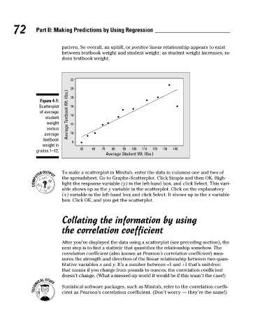
pattern. So overall, an uphill, or positive linear relationship appears to exist
between textbook weight and student weight; as student weight increases, so
does textbook weight.
22
20
Average Textbook Wt. (lbs.)
18
Figure 4-1:
Scatterplot
16
of average
14
student
weight
12
versus
10
average
textbook
8
weight in
50 60 70 80 90 100 110 120 130 140
grades 1–12.
Average Student Wt. (lbs.)
To make a scatterplot in Minitab, enter the data in columns one and two of
the spreadsheet. Go to Graphs>Scatterplot. Click Simple and then OK. High-
light the response variable (y) in the left-hand box, and click Select. This vari-
able shows up as the y variable in the scatterplot. Click on the explanatory
(x) variable in the left-hand box and click Select. It shows up in the x variable
box. Click OK, and you get the scatterplot.
Collating the information by using
the correlation coefficient
After you’ve displayed the data using a scatterplot (see preceding section), the
next step is to find a statistic that quantifies the relationship somehow. The
correlation coefficient (also known as Pearson’s correlation coefficient) mea-
sures the strength and direction of the linear relationship between two quan-
titative variables x and y. It’s a number between –1 and +1 that’s unit-free;
that means if you change from pounds to ounces, the correlation coefficient
doesn’t change. (What a messed-up world it would be if this wasn’t the case!)
Statistical software packages, such as Minitab, refer to the correlation coeffi-
cient as Pearson’s correlation coefficient. (Don’t worry — they’re the same!)