
Page 61 -
P. 61
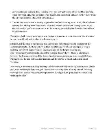
• As we add more training data, training error can only get worse. Thus, the blue training
               error curve can only stay the same or go higher, and thus it can only get further away from
               the (green line) level of desired performance.

             • The red dev error curve is usually higher than the blue training error. Thus, there’s almost
               no way that adding more data would allow the red dev error curve to drop down to the
               desired level of performance when even the training error is higher than the desired level

               of performance.

             Examining both the dev error curve and the training error curve on the same plot allows us
             to more confidently extrapolate the dev error curve.

             Suppose, for the sake of discussion, that the desired performance is our estimate of the
             optimal error rate. The figure above is then the standard “textbook” example of what a

             learning curve with high avoidable bias looks like: At the largest training set
             size—presumably corresponding to all the training data we have—there is a large gap
             between the training error and the desired performance, indicating large avoidable bias.
             Furthermore, the gap between the training and dev curves is small, indicating small
             variance.

             Previously, we were measuring training and dev set error only at the rightmost point of this

             plot, which corresponds to using all the available training data. Plotting the full learning
             curve gives us a more comprehensive picture of the algorithms’ performance on different
             training set sizes.


             Page 61                            Machine Learning Yearning-Draft                       Andrew Ng