Page 275 -
P. 275
264    CHAPTER 10  Usability testing


                         be easy to activate features by accident (e.g. holding the smartphone in your hand and
                         hitting a button; or making a call, putting the phone up to your face, and accidentally
                         selecting a feature).
                            All of these approaches to usability testing have one basic goal: to improve the
                         quality of an interface by finding flaws-areas of the interface that need improvement.
                         While usability testing should discover interface flaws that cause problems for users,
                         at the same time, we want to discover what is working well with an interface design,
                         so that we make sure to keep those features in place! What’s an interface flaw? It is
                         some aspect, some component, some widget of the interface that is confusing, mis-
                         leading, or generally suboptimal. It is not about style or color preferences. Someone
                         may prefer dark blue text instead of black text, on a white background and that’s fine.
                         It becomes a usability problem only when you have white, yellow, orange, or red text
                         on a white background, all of which are hard for the eye to perceive. When we talk
                         about usability testing, we are talking about discovering interface flaws that cause
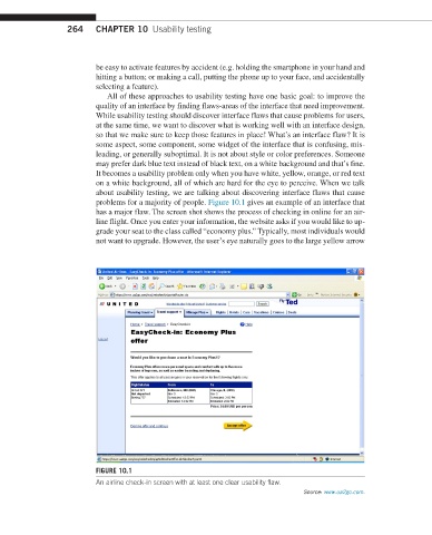
                         problems for a majority of people. Figure 10.1 gives an example of an interface that
                         has a major flaw. The screen shot shows the process of checking in online for an air-
                         line flight. Once you enter your information, the website asks if you would like to up-
                         grade your seat to the class called “economy plus.” Typically, most individuals would
                         not want to upgrade. However, the user’s eye naturally goes to the large  yellow arrow


                         FIGURE 10.1
                         An airline check-in screen with at least one clear usability flaw.
                                                                             Source: www.ua2go.com.

