
Page 74 - Statistics II for Dummies
P. 74
58 Part II: Using Different Types of Regression to Make Predictions
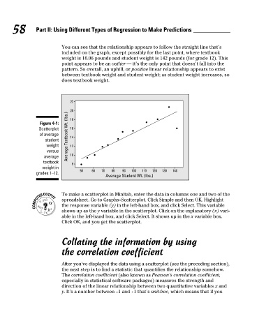
You can see that the relationship appears to follow the straight line that’s
included on the graph, except possibly for the last point, where textbook
weight is 16.06 pounds and student weight is 142 pounds (for grade 12). This
point appears to be an outlier — it’s the only point that doesn’t fall into the
pattern. So overall, an uphill, or positive linear relationship appears to exist
between textbook weight and student weight; as student weight increases, so
does textbook weight.
22
20
Figure 4-1: 18
Scatterplot 16
of average Average Textbook Wt. (lbs.) 14
student
weight 12
versus
average 10
textbook
8
weight in
50 60 70 80 90 100 110 120 130 140
grades 1–12. Average Student Wt. (lbs.)
To make a scatterplot in Minitab, enter the data in columns one and two of the
spreadsheet. Go to Graphs>Scatterplot. Click Simple and then OK. Highlight
the response variable (y) in the left-hand box, and click Select. This variable
shows up as the y variable in the scatterplot. Click on the explanatory (x) vari-
able in the left-hand box, and click Select. It shows up in the x variable box.
Click OK, and you get the scatterplot.
Collating the information by using
the correlation coefficient
After you’ve displayed the data using a scatterplot (see the preceding section),
the next step is to find a statistic that quantifies the relationship somehow.
The correlation coefficient (also known as Pearson’s correlation coefficient,
especially in statistical software packages) measures the strength and
direction of the linear relationship between two quantitative variables x and
y. It’s a number between –1 and +1 that’s unit-free, which means that if you
09_466469-ch04.indd 58 7/24/09 10:20:36 AM