
Page 121 - Statistics for Dummies
P. 121
Chapter 7: Going by the Numbers: Graphing Numerical Data
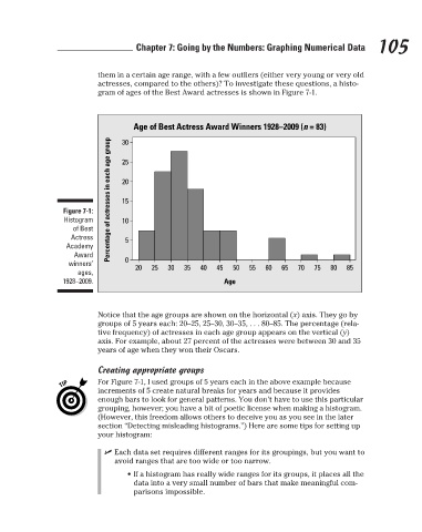
actresses, compared to the others)? To investigate these questions, a histo-
gram of ages of the Best Award actresses is shown in Figure 7-1.
Age of Best Actress Award Winners 1928–2009 (n = 83)
Percentage of actresses in each age group
30
25
20
15
Figure 7-1:
Histogram
10
of Best them in a certain age range, with a few outliers (either very young or very old 105
Actress 5
Academy
Award
winners’ 0 20 25 30 35 40 45 50 55 60 65 70 75 80 85
ages,
1928–2009. Age
Notice that the age groups are shown on the horizontal (x) axis. They go by
groups of 5 years each: 20–25, 25–30, 30–35, . . . 80–85. The percentage (rela-
tive frequency) of actresses in each age group appears on the vertical (y)
axis. For example, about 27 percent of the actresses were between 30 and 35
years of age when they won their Oscars.
Creating appropriate groups
For Figure 7-1, I used groups of 5 years each in the above example because
increments of 5 create natural breaks for years and because it provides
enough bars to look for general patterns. You don’t have to use this particular
grouping, however; you have a bit of poetic license when making a histogram.
(However, this freedom allows others to deceive you as you see in the later
section “Detecting misleading histograms.”) Here are some tips for setting up
your histogram:
✓ Each data set requires different ranges for its groupings, but you want to
avoid ranges that are too wide or too narrow.
• If a histogram has really wide ranges for its groups, it places all the
data into a very small number of bars that make meaningful com-
parisons impossible.
3/25/11 8:16 PM
12_9780470911082-ch07.indd 105 3/25/11 8:16 PM
12_9780470911082-ch07.indd 105