
Page 117 - Statistics for Dummies
P. 117
Chapter 6: Getting the Picture: Graphing Categorical Data
of crimes of each type shown where each half inch of a bar represents 500
crimes, versus 100 crimes. This squeezes the numbers together and makes
differences less noticeable. Her opponent in the next election would go the
other way and use a stretched-out scale to emphasize a crime increase in
dramatic fashion, and voilà! (Now you know the answer to the question “How
can two people talk about the same data and get two different conclusions?”
Welcome to the world of politics.)
With a pie chart, however, the scale can’t be changed to over-emphasize (or
downplay) the results. No matter how you slice up a pie chart, you’re always
slicing up a circle, and the proportion of the total pie belonging to any given
slice won’t change, even if you make the pie bigger or smaller.
Pondering pet peeves
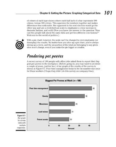
A recent survey of 100 people with office jobs asked them to report their big-
gest pet peeves in the workplace. (Before going on, you may want to jot down 101
a couple of yours, just for fun.) A bar graph of the results of the survey is
shown in Figure 6-7. Poor time management looks to be the number-one issue
for these workers (I hope they didn’t do this survey on company time).
Biggest Pet Peeves at Work (n = 100)
Poor time management 43
Gossip 36
Messiness 25
Loud noises 21
Figure 6-7:
Bar graph
for survey Potent scents 20
data with
multiple 0 10 20 30 40
responses. Percent
3/25/11 8:17 PM
11_9780470911082-ch06.indd 101
11_9780470911082-ch06.indd 101 3/25/11 8:17 PM