
Page 114 - Statistics for Dummies
P. 114
98
Part II: Number-Crunching Basics
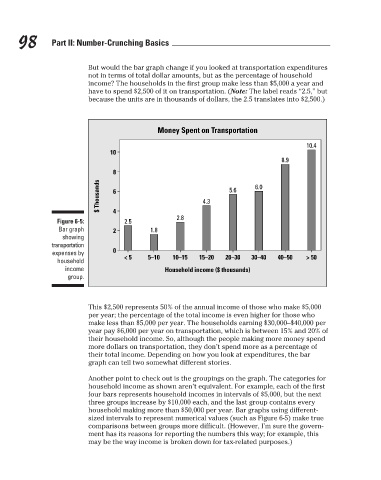
But would the bar graph change if you looked at transportation expenditures
not in terms of total dollar amounts, but as the percentage of household
income? The households in the first group make less than $5,000 a year and
have to spend $2,500 of it on transportation. (Note: The label reads “2.5,” but
because the units are in thousands of dollars, the 2.5 translates into $2,500.)
Money Spent on Transportation
10
8
$ Thousands
6
4
2.8 4.3 5.6 6.0 8.9 10.4
Figure 6-5: 2.5
Bar graph 2 1.8
showing
transportation
expenses by 0
household < 5 5–10 10–15 15–20 20–30 30–40 40–50 > 50
income Household income ($ thousands)
group.
This $2,500 represents 50% of the annual income of those who make $5,000
per year; the percentage of the total income is even higher for those who
make less than $5,000 per year. The households earning $30,000–$40,000 per
year pay $6,000 per year on transportation, which is between 15% and 20% of
their household income. So, although the people making more money spend
more dollars on transportation, they don’t spend more as a percentage of
their total income. Depending on how you look at expenditures, the bar
graph can tell two somewhat different stories.
Another point to check out is the groupings on the graph. The categories for
household income as shown aren’t equivalent. For example, each of the first
four bars represents household incomes in intervals of $5,000, but the next
three groups increase by $10,000 each, and the last group contains every
household making more than $50,000 per year. Bar graphs using different-
sized intervals to represent numerical values (such as Figure 6-5) make true
comparisons between groups more difficult. (However, I’m sure the govern-
ment has its reasons for reporting the numbers this way; for example, this
may be the way income is broken down for tax-related purposes.)
3/25/11 8:16 PM
11_9780470911082-ch06.indd 98 3/25/11 8:16 PM
11_9780470911082-ch06.indd 98