
Page 111 - Statistics for Dummies
P. 111
Chapter 6: Getting the Picture: Graphing Categorical Data
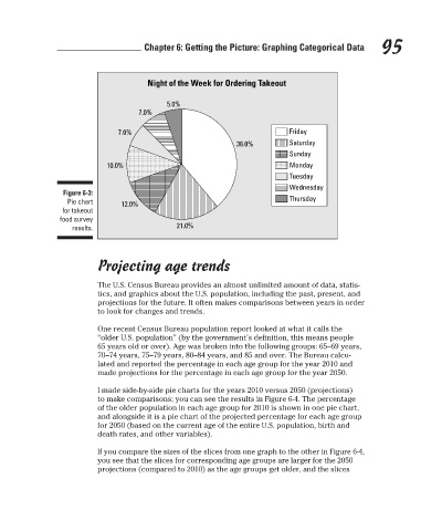
Night of the Week for Ordering Takeout
7.0%
Saturday
Sunday
Monday
Tuesday
Wednesday
Figure 6-3:
Thursday
Pie chart
for takeout
food survey
21.0%
results. 10.0% 12.0% 7.0% 5.0% 38.0% Friday 95
Projecting age trends
The U.S. Census Bureau provides an almost unlimited amount of data, statis-
tics, and graphics about the U.S. population, including the past, present, and
projections for the future. It often makes comparisons between years in order
to look for changes and trends.
One recent Census Bureau population report looked at what it calls the
“older U.S. population” (by the government’s definition, this means people
65 years old or over). Age was broken into the following groups: 65–69 years,
70–74 years, 75–79 years, 80–84 years, and 85 and over. The Bureau calcu-
lated and reported the percentage in each age group for the year 2010 and
made projections for the percentage in each age group for the year 2050.
I made side-by-side pie charts for the years 2010 versus 2050 (projections)
to make comparisons; you can see the results in Figure 6-4. The percentage
of the older population in each age group for 2010 is shown in one pie chart,
and alongside it is a pie chart of the projected percentage for each age group
for 2050 (based on the current age of the entire U.S. population, birth and
death rates, and other variables).
If you compare the sizes of the slices from one graph to the other in Figure 6-4,
you see that the slices for corresponding age groups are larger for the 2050
projections (compared to 2010) as the age groups get older, and the slices
3/25/11 8:16 PM
11_9780470911082-ch06.indd 95 3/25/11 8:16 PM
11_9780470911082-ch06.indd 95