
Page 110 - Statistics for Dummies
P. 110
94
Part II: Number-Crunching Basics
Notice that this pie chart doesn’t tell you how much money came in, only what
percentage of the money came from each type of game. About half the money
(49.3%) came from instant scratch-off games; does this revenue represent a
million dollars, two million dollars, ten million dollars, or more? You can’t
answer these questions without knowing the total amount of revenue dollars.
I was, however, able to find this information on another chart provided by
the lottery Web site: The total revenue (over a 10-year period) was reported
as “1,983.1 million dollars” — which you also know as 1.9831 billion dollars.
Because 49.3% of sales came from instant games, they therefore represent
sales revenue of $977,668,300 over a 10-year period. That’s a lot of (or dare I
say a “lotto”) scratching.
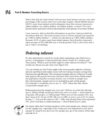
Ordering takeout
It’s also important to watch for totals when examining a pie chart from a
survey. A newspaper I read reported the latest results of a “people poll.”
They asked, “What is your favorite night to order takeout for dinner?” The
results are shown in a pie chart (see Figure 6-3).
You can clearly see that Friday night is the most popular night for ordering
takeout (and that result makes sense) with decreasing demand moving from
Saturday through Monday. The actual percentages shown in Figure 6-3 really
only apply to the people who were surveyed; how close these results mimic
the population depends on many factors, one of which is sample size.
But unfortunately, sample size is not included as part of this graph.
(For example, it would be nice to see “n = XXX” below the title; where
n represents sample size.)
Without knowing the sample size, you can’t tell how accurate the informa-
tion is. Which results would you find to be more accurate — those based on
25 people, 250 people, or 2,500 people? When you see the number 10%, you
don’t know if it’s 10 out of 100, 100 out of 1,000, or even 1 out of 10. To statis-
ticians, 1 ÷ 10 is not the same as 100 ÷ 1,000, even though they both represent
10%. (Don’t tell that to mathematicians — they’ll think you’re nuts!)
Pie charts often don’t include mention of the total sample size. Always check
for the sample size, especially if the results are very important to you; don’t
assume it’s large! If you don’t see the sample size, go to the source of the data
and ask for it.
3/25/11 8:16 PM
11_9780470911082-ch06.indd 94
11_9780470911082-ch06.indd 94 3/25/11 8:16 PM