
Page 115 - Statistics for Dummies
P. 115
Chapter 6: Getting the Picture: Graphing Categorical Data
One last thing: Notice that the numerical groupings in Figure 6-5 overlap on
the boundaries. For example, $30,000 appears in both the 5th and 6th bars of
the graph. So, if you have a household income of $30,000, which bar do you fall
into? (You can’t tell from Figure 6-5, but I’m sure the instructions are buried
in a huge report in the basement of some building in Washington, D.C.) This
kind of overlap appears quite frequently in graphs, but you need to know how
the borderline values are being treated. For example, the rule may be “Any
data lying exactly on a boundary value automatically goes into the bar to its
immediate right.” (Looking at Figure 6-5, that puts a household with a $30,000
income into the 6th bar rather than the 5th.) As long as they are being consis-
tent for each boundary, that’s okay. The alternative, describing the income
boundaries for the 5th bar as “20,000 to $29,999.99,” is not an improvement.
Along those lines, income data can also be presented using a histogram (see
Chapter 7), which has a slightly different look to it.
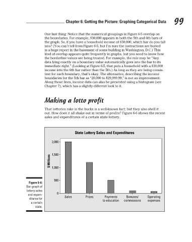
Making a lotto profit
That lotteries rake in the bucks is a well-known fact; but they also shell it 99
out. How does it all shake out in terms of profits? Figure 6-6 shows the recent
sales and expenditures of a certain state lottery.
State Lottery Sales and Expenditures
2,000
$ Millions 1,500
1,000
500
Figure 6-6:
Bar graph of
lottery sales
and expen- 0
Bonuses/
Payments
ditures for Sales Prizes to education commissions Operating
expenses
a certain
state.
3/25/11 8:16 PM
11_9780470911082-ch06.indd 99
11_9780470911082-ch06.indd 99 3/25/11 8:16 PM