
Page 112 - Statistics for Dummies
P. 112
96
Part II: Number-Crunching Basics
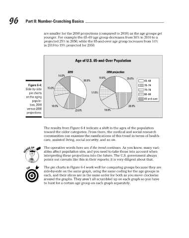
younger. For example the 65–69 age group decreases from 30% in 2010 to a
projected 25% in 2050; while the 85-and-over age group increases from 14%
in 2010 to 19% projected for 2050.
Age of U.S. 65-and-Over Population
2050 projection
2010
14.0%
19.0%
25.0%
30.0%
65–69
Figure 6-4:
70–74
15.0%
Side-by-side
75–79
17.0%
pie charts
80–84
on the aging
85 and over
popula- are smaller for the 2050 projections (compared to 2010) as the age groups get
tion, 2010 18.0% 20.0%
versus 2050 23.0% 19.0%
projections.
The results from Figure 6-4 indicate a shift in the ages of the population
toward the older categories. From there, the medical and social research
communities can examine the ramifications of this trend in terms of health-
care, assisted living, social security, and so on.
The operative words here are if the trend continues. As you know, many vari-
ables affect population size, and you need to take those into account when
interpreting these projections into the future. The U.S. government always
points out caveats like this in their reports; it is very diligent about that.
The pie charts in Figure 6-4 work well for comparing groups because they are
side-by-side on the same graph, using the same coding for the age groups in
each, and their slices are in the same order for both as you move clockwise
around the graphs. They aren’t all scrambled up on each graph so you have
to hunt for a certain age group on each graph separately.
3/25/11 8:16 PM
11_9780470911082-ch06.indd 96 3/25/11 8:16 PM
11_9780470911082-ch06.indd 96