
Page 116 - The Presentation Secrets of Steve Jobs How to Be Insanely Great in Front of Any Audience by Carmine Gallo
P. 116
CHANNEL THEIR INNER ZEN 97
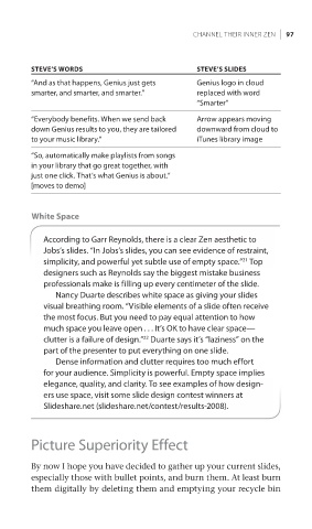
STEVE’S WORDS STEVE’S SLIDES
“And as that happens, Genius just gets Genius logo in cloud
smarter, and smarter, and smarter.” replaced with word
“Smarter”
“Everybody benefits. When we send back Arrow appears moving
down Genius results to you, they are tailored downward from cloud to
to your music library.” iTunes library image
“So, automatically make playlists from songs
in your library that go great together, with
just one click. That’s what Genius is about.”
[moves to demo]
White Space
According to Garr Reynolds, there is a clear Zen aesthetic to
Jobs’s slides. “In Jobs’s slides, you can see evidence of restraint,
simplicity, and powerful yet subtle use of empty space.” Top
21
designers such as Reynolds say the biggest mistake business
professionals make is filling up every centimeter of the slide.
Nancy Duarte describes white space as giving your slides
visual breathing room. “Visible elements of a slide often receive
the most focus. But you need to pay equal attention to how
much space you leave open . . . It’s OK to have clear space—
clutter is a failure of design.” Duarte says it’s “laziness” on the
22
part of the presenter to put everything on one slide.
Dense information and clutter requires too much effort
for your audience. Simplicity is powerful. Empty space implies
elegance, quality, and clarity. To see examples of how design-
ers use space, visit some slide design contest winners at
Slideshare.net (slideshare.net/contest/results-2008).
Picture Superiority Effect
By now I hope you have decided to gather up your current slides,
especially those with bullet points, and burn them. At least burn
them digitally by deleting them and emptying your recycle bin