
Page 126 - Computational Statistics Handbook with MATLAB
P. 126
Chapter 5: Exploratory Data Analysis 113
g
gr
raamms
Histo
Histo ggrr aamm ss s
HistoHisto
A histogram is a way to graphically represent the frequency distribution of a
data set. Histograms are a good way to
• summarize a data set to understand general characteristics of the
distribution such as shape, spread or location,
• suggest possible probabilistic models, or
• determine unusual behavior.
In this chapter, we look only at the simple, basic histogram. Variants and
extensions of the histogram are discussed in Chapter 8.
A frequency histogram is obtained by creating a set of bins or intervals that
cover the range of the data set. It is important that these bins do not overlap
and that they have equal width. We then count the number of observations
that fall into each bin. To visualize this, we plot the frequency as the height of
a bar, with the width of the bar representing the width of the bin. The histo-
gram is determined by two parameters, the bin width and the starting point
of the first bin. We discuss these issues in greater detail in Chapter 8. Relative
frequency histograms are obtained by representing the height of the bin by
the relative frequency of the observations that fall into the bin.
The basic MATLAB package has a function for calculating and plotting a
univariate histogram. This function is illustrated in the example given below.
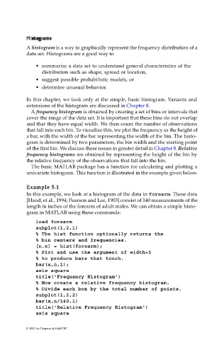
Example 5.1
In this example, we look at a histogram of the data in forearm. These data
[Hand, et al., 1994; Pearson and Lee, 1903] consist of 140 measurements of the
length in inches of the forearm of adult males. We can obtain a simple histo-
gram in MATLAB using these commands:
load forearm
subplot(1,2,1)
% The hist function optionally returns the
% bin centers and frequencies.
[n,x] = hist(forearm);
% Plot and use the argument of width=1
% to produce bars that touch.
bar(x,n,1);
axis square
title('Frequency Histogram')
% Now create a relative frequency histogram.
% Divide each box by the total number of points.
subplot(1,2,2)
bar(x,n/140,1)
title('Relative Frequency Histogram')
axis square
© 2002 by Chapman & Hall/CRC