Page 127 - Computational Statistics Handbook with MATLAB
P. 127

114                        Computational Statistics Handbook with MATLAB


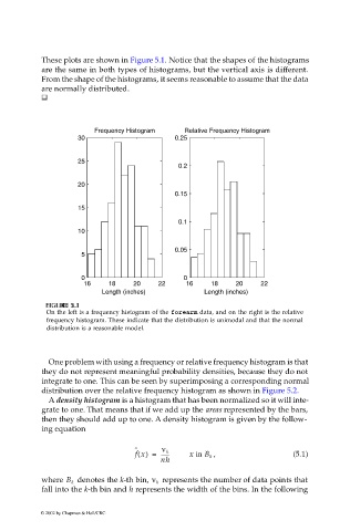
                             These plots are shown in Figure 5.1. Notice that the shapes of the histograms
                             are the same in both types of histograms, but the vertical axis is different.
                             From the shape of the histograms, it seems reasonable to assume that the data
                             are normally distributed.


                                          Frequency Histogram    Relative Frequency Histogram
                                      30                      0.25


                                      25
                                                               0.2
                                      20
                                                              0.15
                                      15
                                                               0.1
                                      10

                                                              0.05
                                       5

                                       0                        0
                                       16    18     20    22     16    18     20    22
                                            Length (inches)           Length (inches)

                               U
                              F FI  IG URE G 5.  RE 5. 1  1
                                     1
                               GU
                              F F II  GU  RE RE 5. 5.  1
                              On the left is a frequency histogram of the forearm data, and on the right is the relative
                              frequency histogram. These indicate that the distribution is unimodal and that the normal
                              distribution is a reasonable model.
                              One problem with using a frequency or relative frequency histogram is that
                             they do not represent meaningful probability densities, because they do not
                             integrate to one. This can be seen by superimposing a corresponding normal
                             distribution over the relative frequency histogram as shown in Figure 5.2.
                              A density histogram is a histogram that has been normalized so it will inte-
                             grate to one. That means that if we add up the areas represented by the bars,
                             then they should add up to one. A density histogram is given by the follow-
                             ing equation

                                                    ˆ      ν k
                                                    f x() =  ------  x in B k  ,            (5.1)
                                                           nh

                                                           represents the number of data points that
                             where B k   denotes the k-th bin, ν k
                             fall into the k-th bin and h represents the width of the bins. In the following

                            © 2002 by Chapman & Hall/CRC
   122   123   124   125   126   127   128   129   130   131   132