
Page 120 - Excel Data Analysis
P. 120
07 537547 Ch06.qxd 3/4/03 12:09 PM Page 106
EXCEL DATA ANALYSIS
CHART BASICS
ou can create charts in Excel to provide a graphical With most chart types, you can display up to 255 different
representation of data within a workbook and to data series on one chart. The only exception is a pie chart,
Y illustrate specific relationships between selected which can only display one data series. All standard, 2D
data values. Excel provides several different types of charts, charts can display up to 32,000 individual data points, or
and you can customize the attributes of each chart type for values. All 3D charts can only display 4,000 data points.
your data.
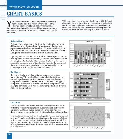
Column Chart
Column charts allow you to illustrate the relationship between
different groups of data values. Each data point displays as a
separate vertical column on the chart. With stacked charts, Excel
places one set of values on top of the other within each column.
Data points are color-coded to identify each data series.
Typically, you use column charts to show data changes that occur
over a period of time. For example, a column chart works well for
showing the sales totals for the year. You display the time values
across the horizontal axis of the chart to illustrate the passage of
time. For example, you can display the months of the year in
chronological order on the axis from left to right.
Bar Chart
Bar charts display each data point, or value, as a separate,
horizontal bar. With stacked bar charts, related data items are
stacked together on a bar. Bar charts work well for showing
comparisons between different sets of data values. This type of
comparison is referred to as whole-to-whole comparison. For
example, bar charts work well for comparing sales from different
states for a corporation.
Line Chart
Line charts create continuous lines that connect each data point
within the corresponding data series. Each separate colored line
represents a data series. You can select a chart sub-type that
displays markers representing each individual data point on the line.
Line charts work very well for showing data changes over a period
of time. Typically, the horizontal axis displays the passage of time,
with the time values displayed in chronological order from left to
right across the axis. For example, you would display the months
of the year across the axis to show the sales for each month within
your organization.
106