
Page 122 - Excel Data Analysis
P. 122
07 537547 Ch06.qxd 3/4/03 12:09 PM Page 108
EXCEL DATA ANALYSIS
CHART BASICS (CONTINUED)
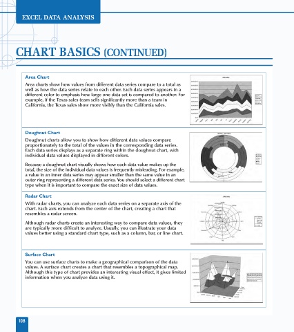
Area Chart
Area charts show how values from different data series compare to a total as
well as how the data series relate to each other. Each data series appears in a
different color to emphasis how large one data set is compared to another. For
example, if the Texas sales team sells significantly more than a team in
California, the Texas sales show more visibly than the California sales.
Doughnut Chart
Doughnut charts allow you to show how different data values compare
proportionately to the total of the values in the corresponding data series.
Each data series displays as a separate ring within the doughnut chart, with
individual data values displayed in different colors.
Because a doughnut chart visually shows how each data value makes up the
total, the size of the individual data values is frequently misleading. For example,
a value in an inner data series may appear smaller than the same value in an
outer ring representing a different data series. You should select a different chart
type when it is important to compare the exact size of data values.
Radar Chart
With radar charts, you can analyze each data series on a separate axis of the
chart. Each axis extends from the center of the chart, creating a chart that
resembles a radar screen.
Although radar charts create an interesting way to compare data values, they
are typically more difficult to analyze. Usually, you can illustrate your data
values better using a standard chart type, such as a column, bar, or line chart.
Surface Chart
You can use surface charts to make a geographical comparison of the data
values. A surface chart creates a chart that resembles a topographical map.
Although this type of chart provides an interesting visual effect, it gives limited
information when you analyze data using it.
108